What should this brand say before anyone reads a single word about it?
That is where our logo design process usually begins.
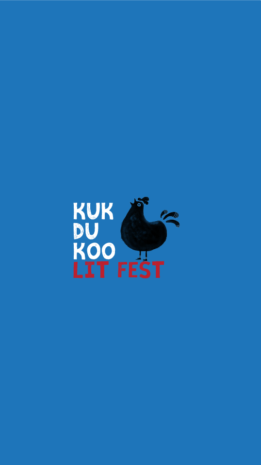
Take Kukdukoo, for example.
It was a literature festival for children. The audience was young and full of imagination.
A serious, polished, corporate-looking identity would never have felt right. So, we did not
begin with fonts and colours. We began with the personality of the festival.
It had to feel fun. Handmade. Creative. A little imperfect, in the most beautiful way.
That is how a hand-drawn and hand-painted rooster became the face of Kukdukoo.
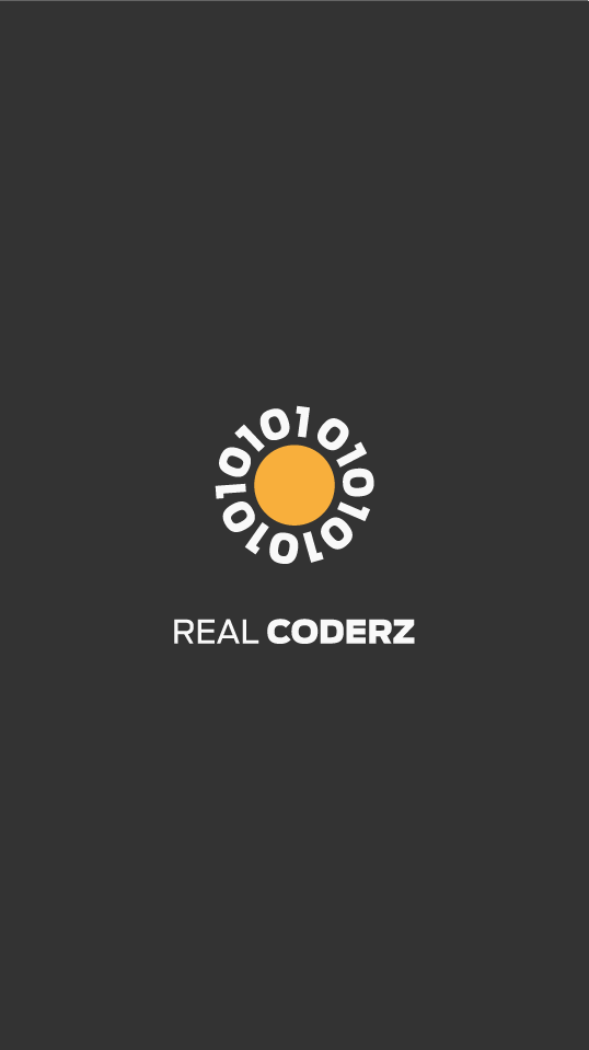
Then came Real Coders. A completely different world.
This time, we were speaking about technology, coding, logic, and the future. There was no
room for the playful visual language we had used for Kukdukoo.
For Real Coders, we worked with the most basic language of computers—0 and 1. But instead of
simply placing binary numbers inside a technology symbol, we used them to create the shape of
a rising sun. The idea connected two thoughts: coding and possibility. Technology and a new beginning.
The same design approach would never have worked for Kukdukoo. And the Kukdukoo approach would
never have worked for Real Coders. Because a logo should carry the brand’s personality.
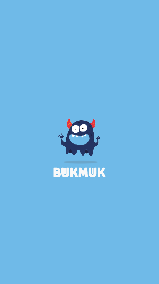
Then there was Bukmuk, an online library.........
The client wanted a monster as the mascot. That sounded simple until we heard the complete brief.
The monster had to be cute. And that created an interesting problem. Monsters are usually meant
to be scary. Children are supposed to run away from them, not become friends with them.
So, our challenge was not simply to draw a monster. It was to create a character that still felt
like a monster but was friendly enough to live in the world of children and books. That balance
became the design.
A monster, yes. But one you would happily read a story with.
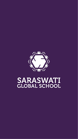
With Saraswati Global School, the design language changed again.
The name itself carried a deep Indian cultural connection. Saraswati, associated with knowledge
and learning, gave us a clear direction. The identity had to feel rooted, graceful, and Indian
without becoming old-fashioned. So, we explored forms inspired by Indian visual traditions and
carefully built the identity around the character of the school.
We also worked with the letter S and incorporated a symbolic form that complemented the school’s
cultural and educational positioning. Again, the objective was not decoration.
It was communication.
The logo needed to feel connected to the name Saraswati, the values behind it, and the kind of
school identity the institution wanted to build.
Then came Moksh International School. The school had a strong focus on spirituality,
emotional well-being, and mental health. The word Moksh itself opened an entirely different
creative world.
This time, our attention went to the letter O. We treated it like a celestial form—a
symbol that could quietly suggest a larger universe, inner consciousness, spirituality, and a
journey beyond the purely physical.
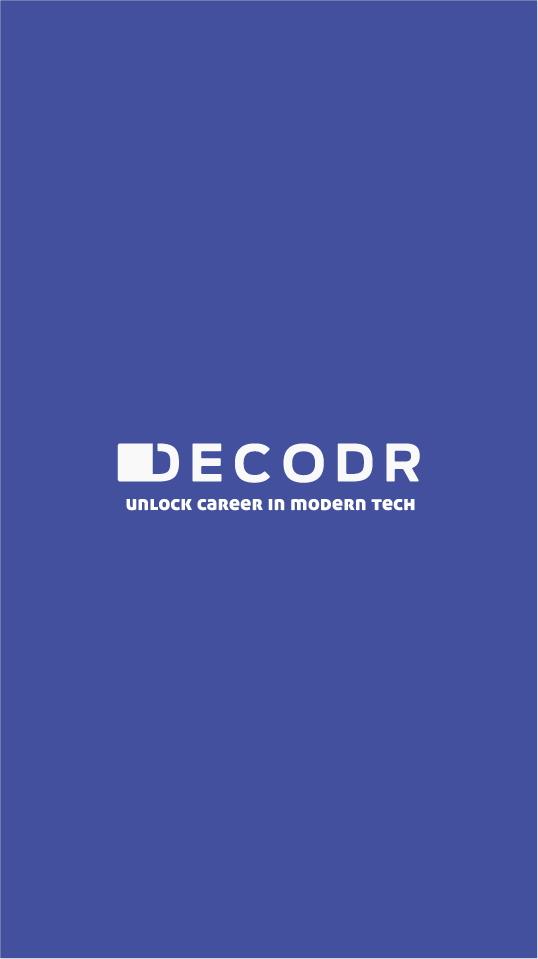
Another example was Decoder, an EdTech brand.
The name gave us a strong starting point: decoding, solving, opening, understanding. So we
worked with the letter D and treated it like an unlocked lock.
The logo did not simply say Decoder. It visually hinted at what decoding really means—opening
something that was once difficult to access.
A small design decision carried the brand idea.
Over the years, we have created more than 30 logos and brand identities, and every project has
taught us the same lesson:
a good logo should never begin with the question, “What shape should we make?”
It should begin with better questions.
Who is this brand speaking to?
What is its personality?
What does it believe in?
What should people feel when they see it?
What single thought can the identity communicate before the explanation even begins?
Only after answering those questions do we start thinking about shapes, symbols, colours,
typography, and visual language. That is the opportunity we see in every project.
For us, logo design is not about making a shape that looks good. It is about finding a visual
idea that belongs only to that brand. Because the strongest logos do more than identify a name.
They begin telling the story before the brand says a word.