
Real Coderz is a Noida-based technology training organisation established around 2011–12 to address a clear industry gap: companies struggle to find job-ready coding talent, while many engineering graduates remain under-skilled for real technology roles. Real Coderz works with graduates through intensive training, boot camps and exposure to real projects, typically over three to six months, helping them build the practical coding skills required by employers. Positioned between higher education and the technology industry, the brand therefore needed to appeal to young learners while also carrying enough professionalism and credibility for corporate audiences.
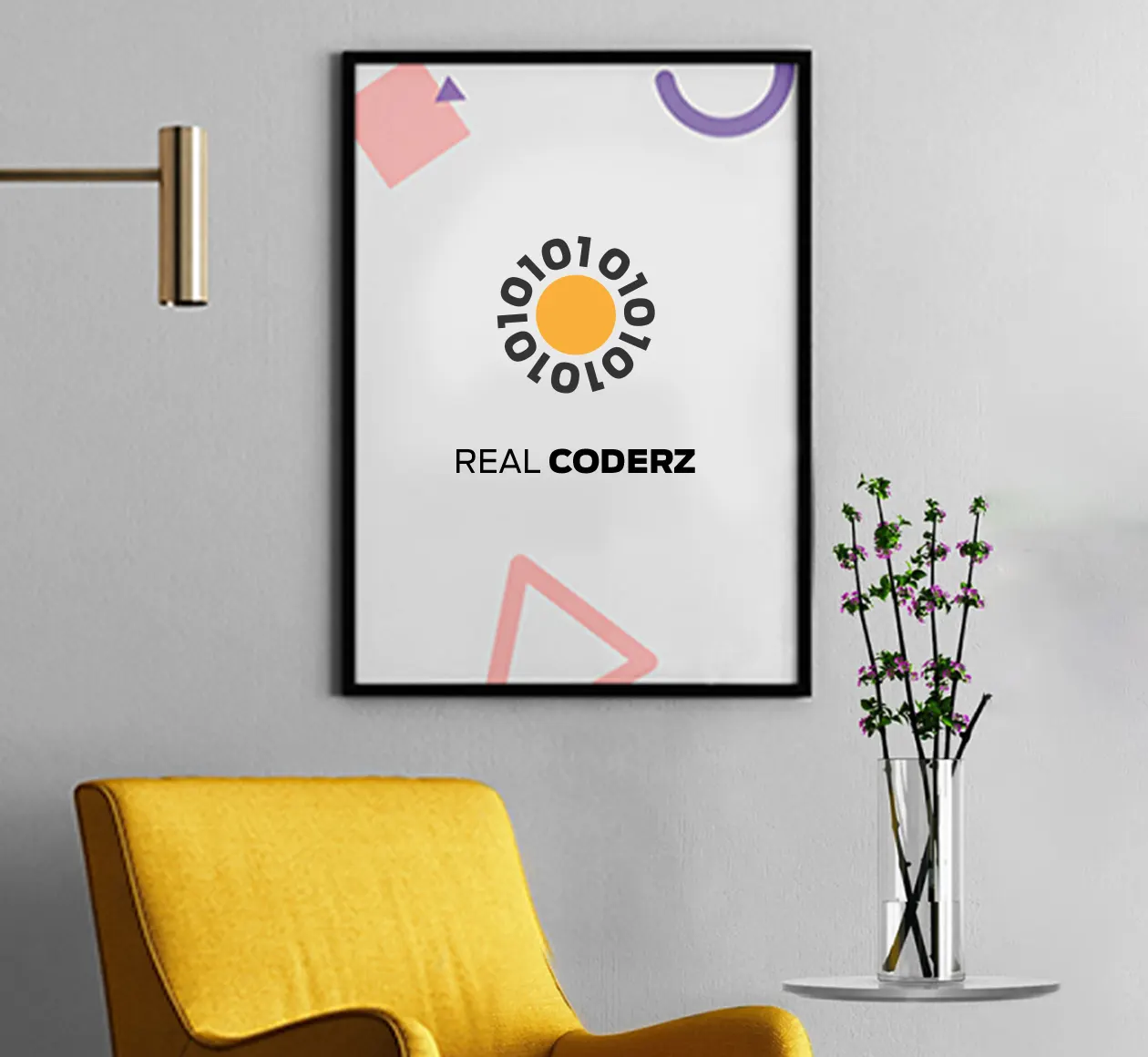
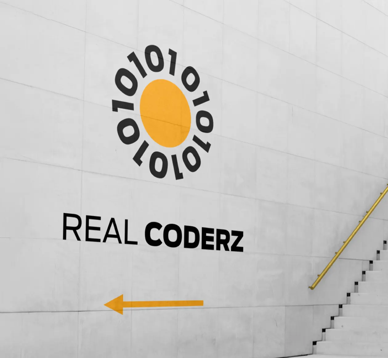
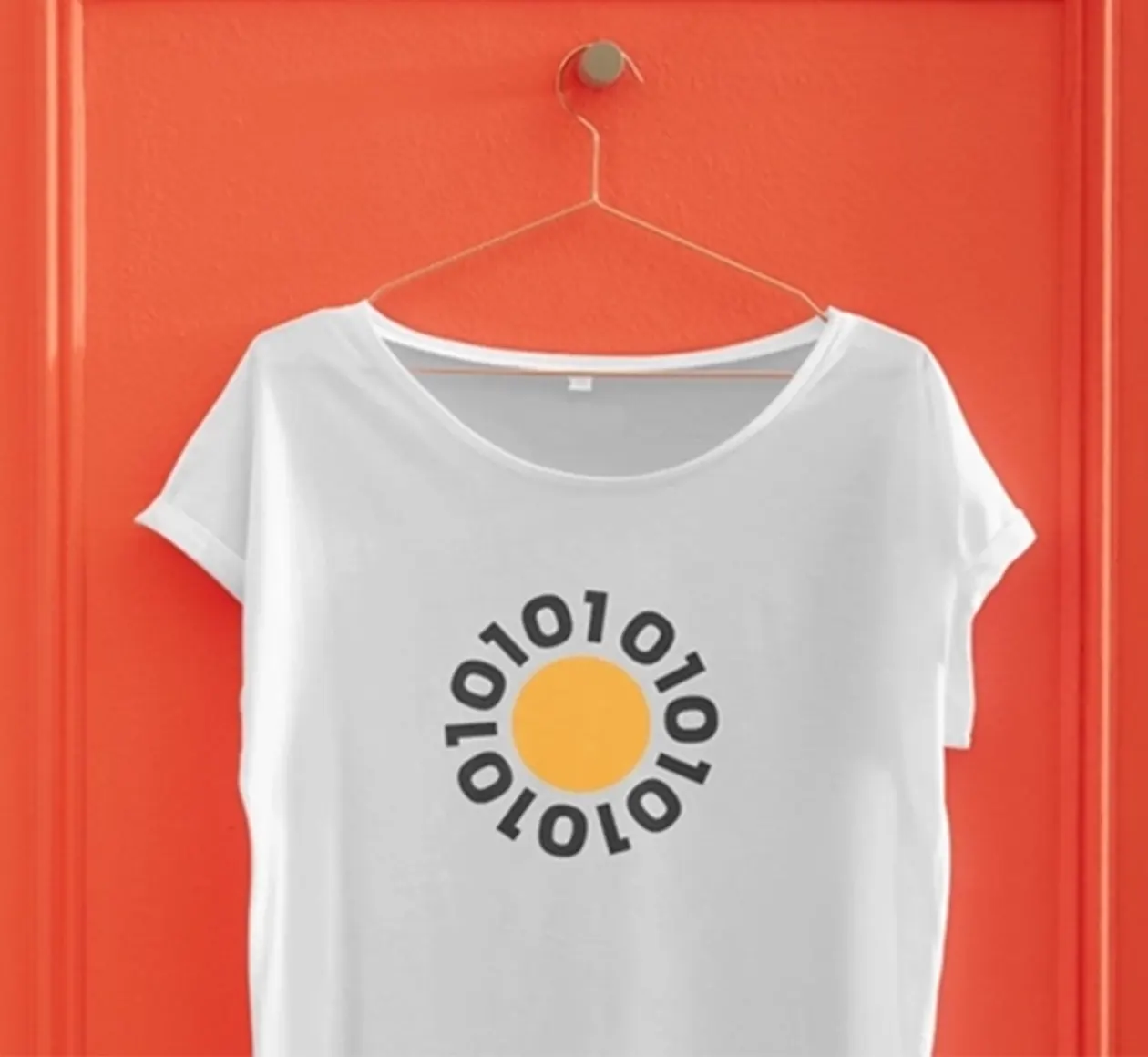
The founder, Ravi Singh, wanted the sun to be part of the identity—an idea connected personally to his name, as Ravi means sun in Hindi. Rather than using a conventional sun symbol, the design brings the organisation’s coding world into the same form. The circular yellow centre becomes the sun, while its rays are constructed from repeating 0s and 1s, the visual language of binary code. This transforms a familiar symbol into something specific to Real Coderz, connecting the founder’s personal reference with the brand’s technology-led purpose.
The identity balances two audiences that Real Coderz needs to speak to: young graduates and the professional technology industry. The circular sun introduces optimism, energy and accessibility, while the surrounding binary forms make the identity immediately relevant to computing. Its construction remains simple and direct rather than overly technical, helping the brand feel approachable to learners. At the same time, the strong geometry, restrained palette and structured typography create enough seriousness for a business operating within the corporate talent and technology ecosystem.

Binary Rays Give the Symbol Its Distinction
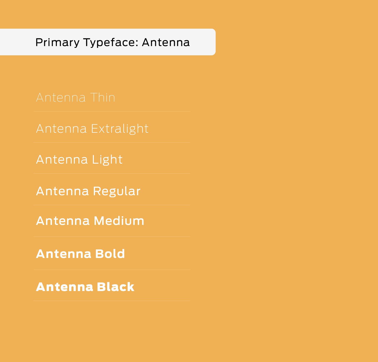
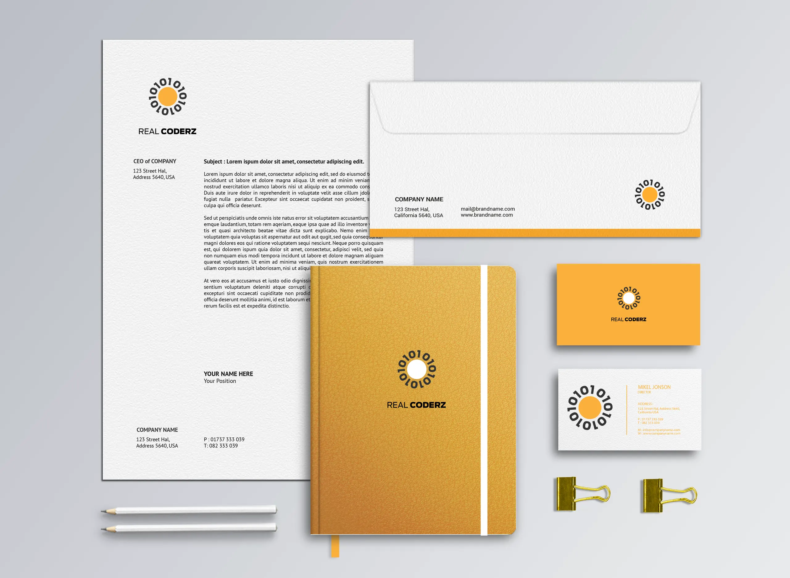
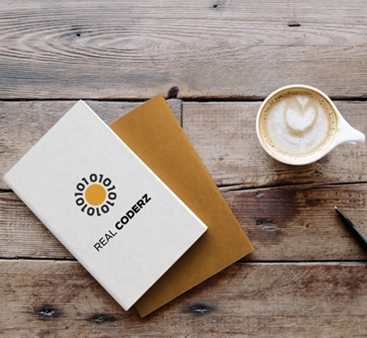
The logo is built from a large central circle surrounded by 0 and 1 forms arranged radially, allowing binary code to perform the visual role normally played by sun rays. This repeated geometry creates rhythm and makes the symbol readable both conceptually and visually. The typography uses a clean, strong sans-serif structure with different weights to establish hierarchy: Real remains lighter while Coderz carries greater emphasis. The straightforward letterforms complement the geometric symbol and help the identity remain practical across horizontal and vertical applications.
Yellow and Black Balance Youth with Professionalism
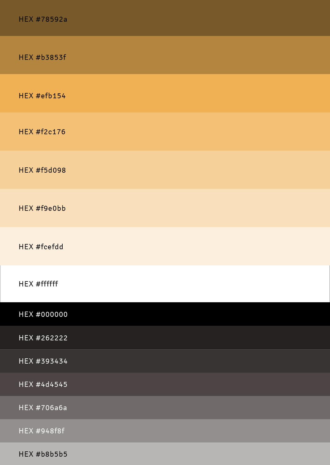
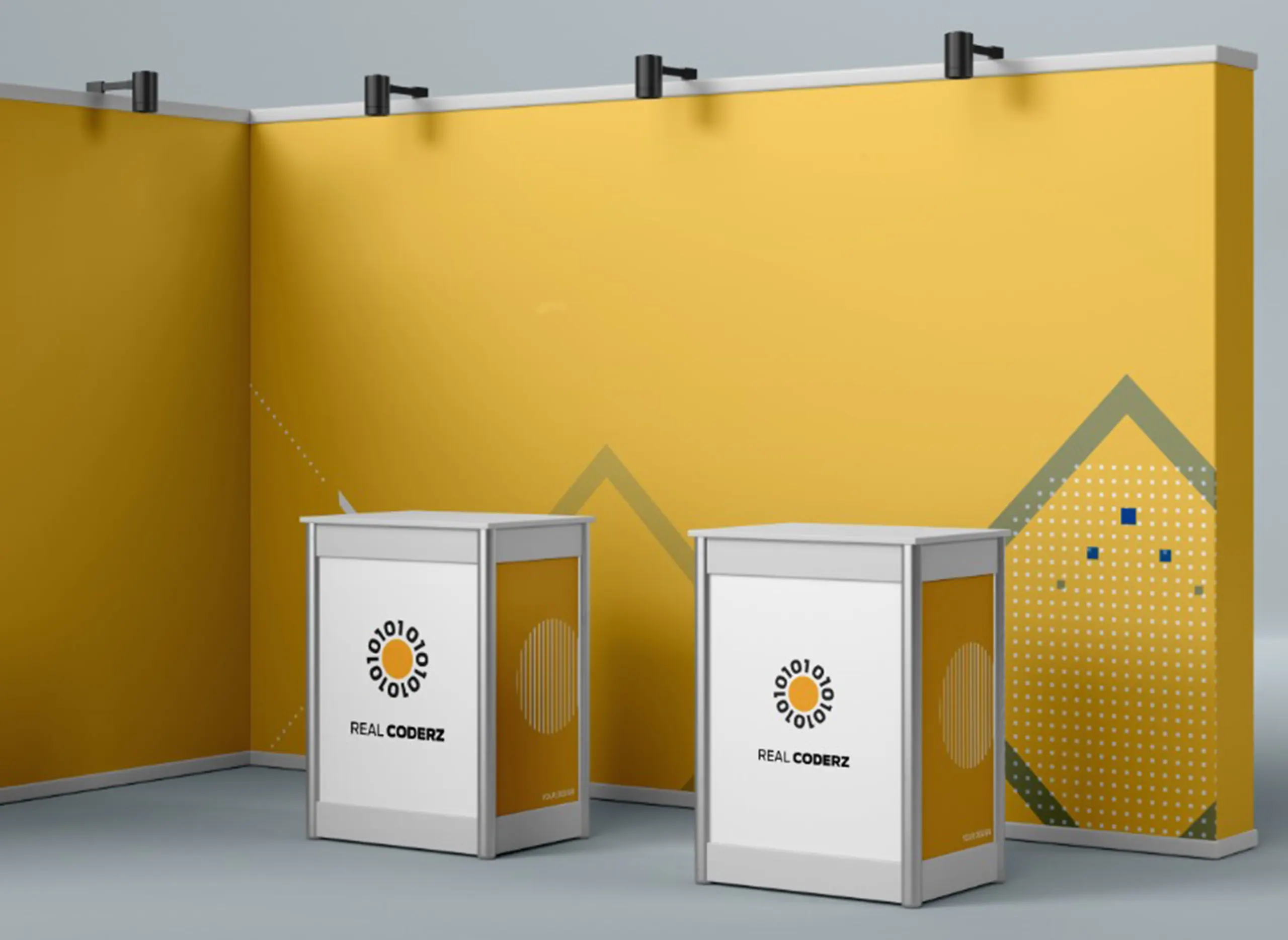
The yellow-and-black palette reflects the two sides of the Real Coderz personality. Yellow gives the identity brightness, optimism and youthful energy, making it appropriate for graduates entering a new stage of their careers. Black provides the counterbalance—strong, serious and professional—helping the brand remain credible within a corporate and technology environment. The contrast is also highly functional: the bright central sun becomes an immediate focal point while the darker binary forms frame it clearly, giving the identity strong recognition without requiring a complex colour system.

Before Setting Foot on Campus,
Parents Will Check Your School on Instagram.