Bringing a New Generation into the Institution
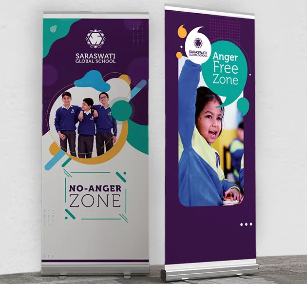
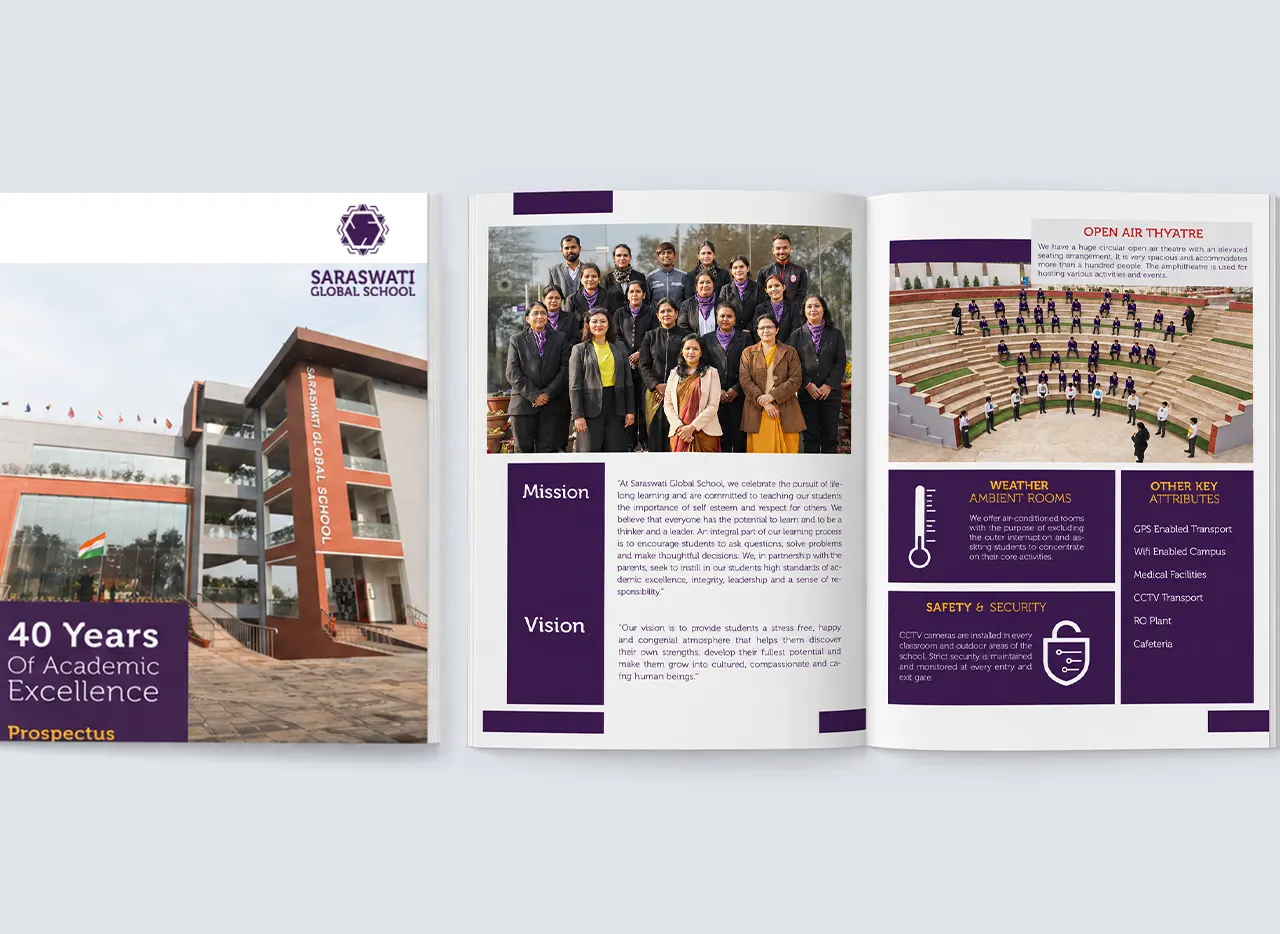
The school emerged when the second generation of the family envisioned a more modern educational institution for a rapidly changing neighbourhood. While the group already operated established schools in the region, Saraswati Global School needed a distinct identity suited to its newer proposition and audience. School Saarthi was brought into the project in 2019, with branding becoming an important part of establishing this new chapter. The objective was not to disconnect from the institution’s roots, but to create an education brand identity that could feel more contemporary, premium and relevant.
Building the Identity Around an Indian Visual Language
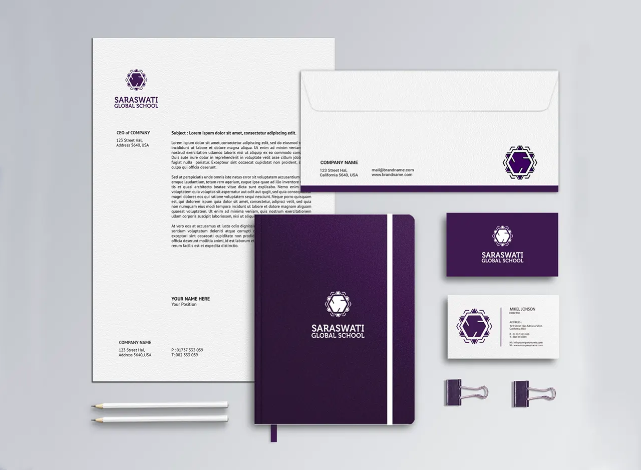
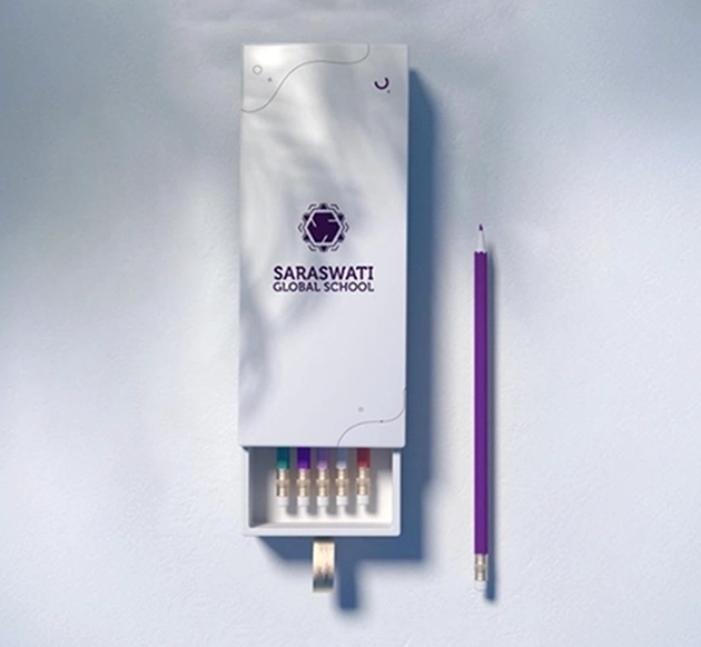
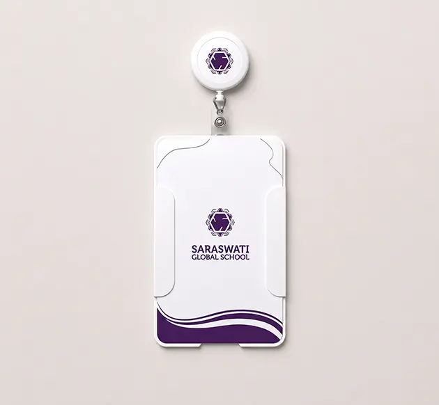
The name Saraswati naturally carries a strong association with knowledge and education in Indian culture. Rather than creating a generic academic symbol, the identity was developed through an Indian visual vocabulary. The central mark combines the structure of the letter S with geometry inspired by the traditional swastika form, creating a symbol that feels culturally rooted without becoming a literal reproduction of either element. Additional ornamental geometry around the centre gives the mark a more crafted and ceremonial quality, strengthening its connection with Indian visual traditions.
Cultural Roots Presented with a Premium Character
The identity was designed to feel distinctly Indian while still appealing to an audience increasingly exposed to modern, urban school brands. Its geometric construction gives the logo discipline and structure, while the repeated decorative forms introduce richness and visual depth. This combination allows the brand to feel rooted without appearing old-fashioned. The result is a school branding language that communicates heritage, refinement and confidence—important for an institution positioned between an established local legacy and the expectations of Faridabad’s newer urban communities.