Peacock Scholarship

  • Logo + Branding
  • Print Design

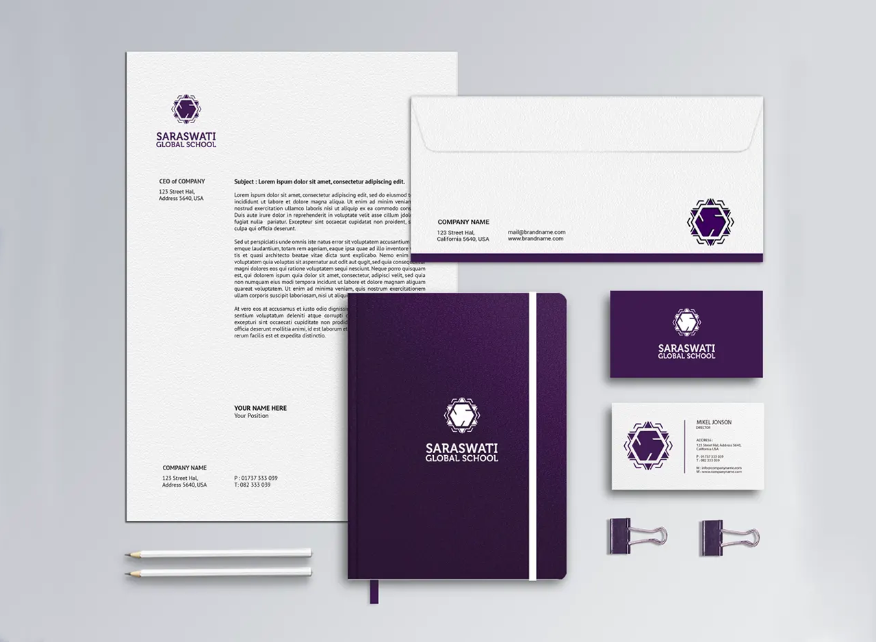
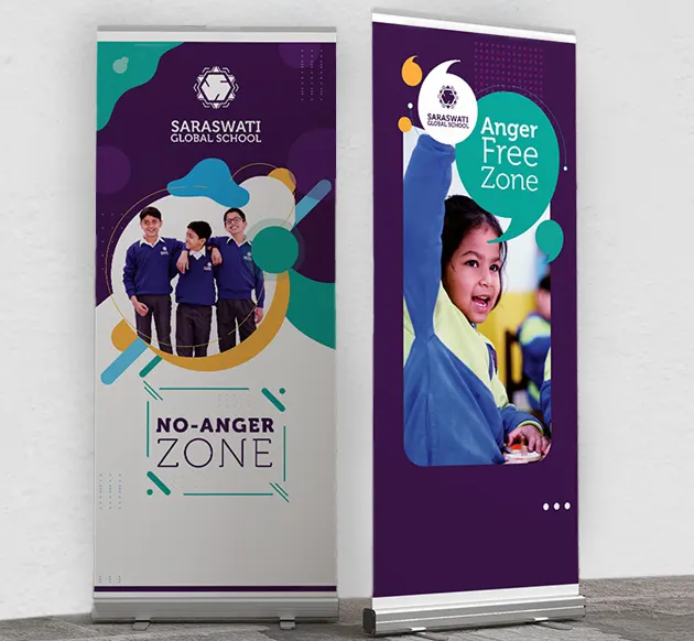
A Scholarship Identity Connected to Saraswati Global School

Project Brand Identity & Branding
Client Saraswati Global School

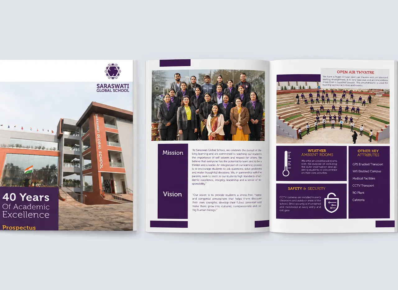
Peacock Scholarship was developed as a sub-brand of Saraswati Global School rather than as an independent institutional brand. The idea emerged from the school’s marketing strategy, creating another way to reach parents through a scholarship-led proposition while still building familiarity and credibility for the parent school. Backed by a more than 40-year-old educational institution with multiple schools in the Faridabad region, the identity needed to feel credible in its own right while remaining visibly connected to Saraswati Global School.

From a Marketing Idea to a Distinct Identity

The Peacock Scholarship began as a communication and outreach idea before evolving into a separate visual identity. Once the concept was accepted by Saraswati Global School, the opportunity was to create a recognisable identity around it rather than present the scholarship merely as another campaign. This gave the initiative a stronger presence in parent communication while allowing the school to approach the market more indirectly. The resulting sub-brand therefore works as an extension of Saraswati Global School’s broader education branding rather than competing with the main school identity.

Making the Peacock the Natural Visual Centre

With a name like Peacock Scholarship, the bird itself became the most direct and memorable visual idea. The mark uses a simplified peacock silhouette with an extended ornamental tail, allowing the identity to remain immediately readable without becoming overly illustrative. The sweeping feather forms bring movement and elegance, while the circular accents within the plumage add rhythm and visual interest. Rather than trying to create an abstract metaphor, the design embraces the strength of the name and turns it into an easily recognisable symbol.

Familiar to the Parent Brand, Distinct in Character

The identity carries the visual familiarity of Saraswati Global School while introducing a more expressive and celebratory personality. Purple creates the strongest link with the parent brand, establishing continuity and institutional association. The peacock form, flowing feather structure and brighter accent colours make the scholarship identity feel more approachable, energetic and distinctive. This balance is important for a sub-brand: it feels connected enough to inherit credibility from Saraswati Global School, yet individual enough to build its own recall across scholarship communication and promotional material.

A Flowing Symbol Supported by Strong Typography

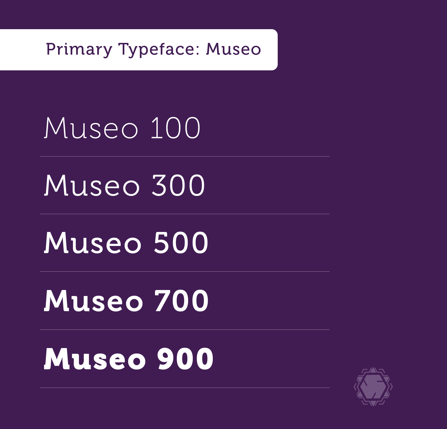
The peacock is built through a combination of a solid body and long, sweeping feather lines that create a sense of openness and movement. Curves dominate the composition, giving the symbol a graceful character while maintaining a clear silhouette. The typography follows the visual language of the parent school identity, reinforcing brand continuity. Its strong, straightforward serif treatment provides stability beneath the more decorative symbol. The contrast between expressive illustration and structured typography helps the overall school brand identity remain both memorable and credible.

Purple Continuity with Fresh Green and Yellow Accents

Purple remains the dominant colour so that Peacock Scholarship retains a clear visual connection with Saraswati Global School. Green and yellow are introduced selectively within the feathers, creating differentiation without breaking that relationship. The green brings freshness against the deeper purple, while the small yellow accents add warmth and visual emphasis. Because these secondary colours appear only in limited areas, the identity remains controlled rather than becoming overly colourful. The palette therefore creates a useful balance between parent-brand continuity and sub-brand distinction.

Before Setting Foot on Campus,
Parents Will Check Your School on Instagram.

CLIENTS STORY

Listen What
Our Clients Saying

Deepika Sharma, Grand Columbus International School, Faridabad

“In 2019, I visited an acquaintance's institution and was impressed with the quality of the branding and marketing work. After five years, the School Saarthi team did justice to our school brand. Be it admission enquiries, website design, or offline campaigns, they have been the best.”

Anubhav Maheshwari, Founder

Saraswati Global School, Greater Faridabad

First principles thinking in education
expressed with primitives

Sip, an AlcoBev delivery platform will deliver alcohol of your choice, to your doorsteps across India now. A much awaited business and delivery platform deserved a unique and celebratory brand idea and approach. ICD creates a memorable, distinct and a delightful brand position, to catch the troubled consumer’s attention. Shop—ship—sip, now always in peace!

More Logo + Branding