From a Rural Beginning to Modern Gurgaon
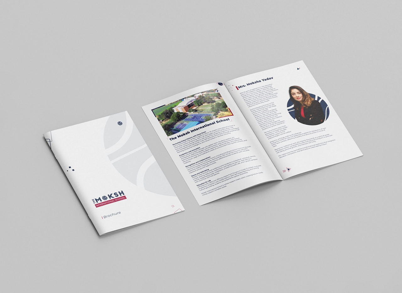
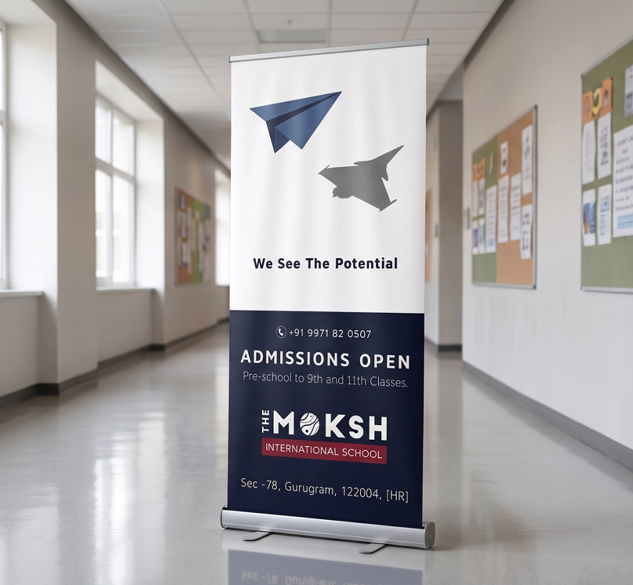
Founded in 1992, the school began at a time when this part of Gurgaon was still largely rural. As Gurgaon evolved into a major urban centre, the surrounding areas changed rapidly too, attracting new residential communities and families from across India. With the second generation taking the institution forward, the school adopted the name Moksh International School as part of a wider identity refresh. The new name called for a school brand identity that could respect its established academic legacy while feeling relevant to the increasingly modern environment around it.
Turning Moksh into a Cosmic Visual Idea
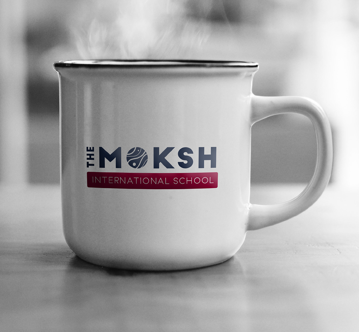
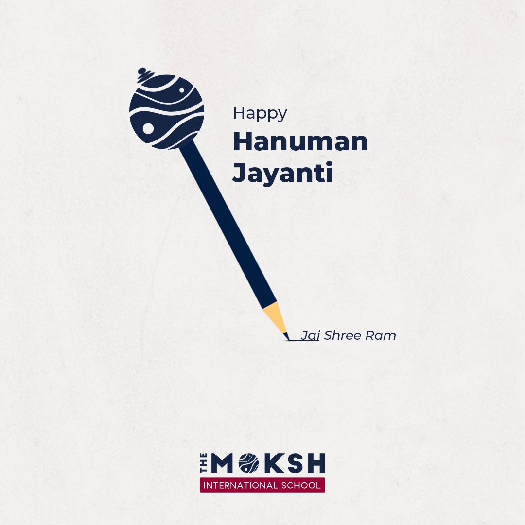
The central idea comes from the meaning and philosophy associated with Moksh. Spirituality and the wider idea of human and cosmic consciousness were important to the school’s leadership, so the letter O became the natural place to introduce this dimension. Instead of treating it as a conventional letterform, it was developed as a self-contained cosmic body. Flowing orbital lines, curved spatial paths and small circular forms give it the character of a world in motion. This symbol also works independently, allowing the school to build recognition beyond the complete wordmark.
Credibility Grounded in Spiritual Imagination
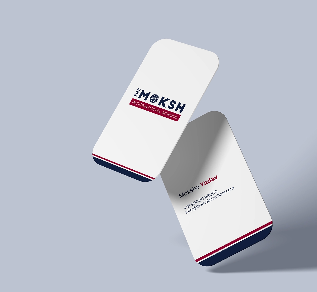
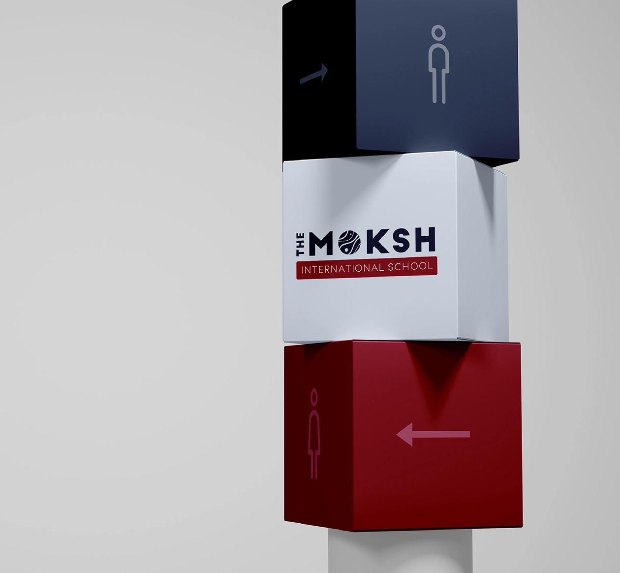
The identity balances two different qualities: institutional credibility and spiritual imagination. The broad, strongly constructed letters give MOKSH confidence and stability, helping the school appear established, responsible and dependable to parents. In contrast, the circular O introduces movement, curiosity and a more contemplative character. This difference prevents the identity from becoming either overly corporate or overtly spiritual. The result is a school logo design that feels contemporary and distinctive while still carrying the seriousness expected from an established educational institution.