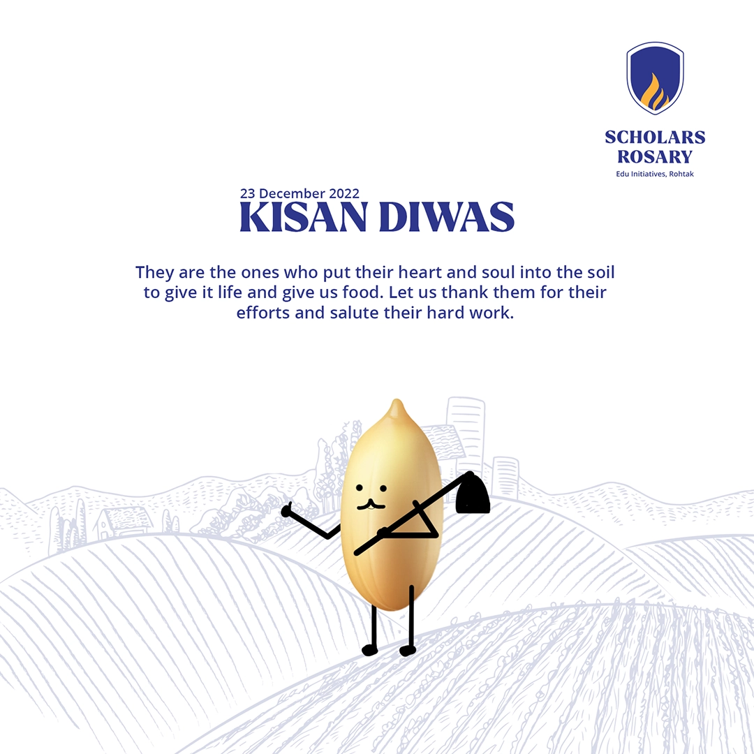
Scholars Rosary is a well-established school in Rohtak, Haryana, with its main campus on Bohar Road. Over more than two decades, it has grown into a leading educational institution in the city, known for strong academics, dependable educational practices and an active alumni community spread across the world. Its main campus serves around 3,200 students, while the wider group—including its other educational institutions—collectively serves approximately 4,700 students. The school today carries the confidence and credibility of an institution that has grown consistently with its community.


When School Saarthi first came on board, the requirement was primarily social media branding rather than a new logo. However, the existing visual identity did not reflect the stature the school had achieved over the years. The school was understandably attached to familiar elements—particularly the flame and the established blue-and-yellow palette. Instead of discarding these, the new identity was developed as an evolution. Familiar visual cues were retained and refined, allowing the school to move towards a stronger brand identity without losing the recognition it had already built.
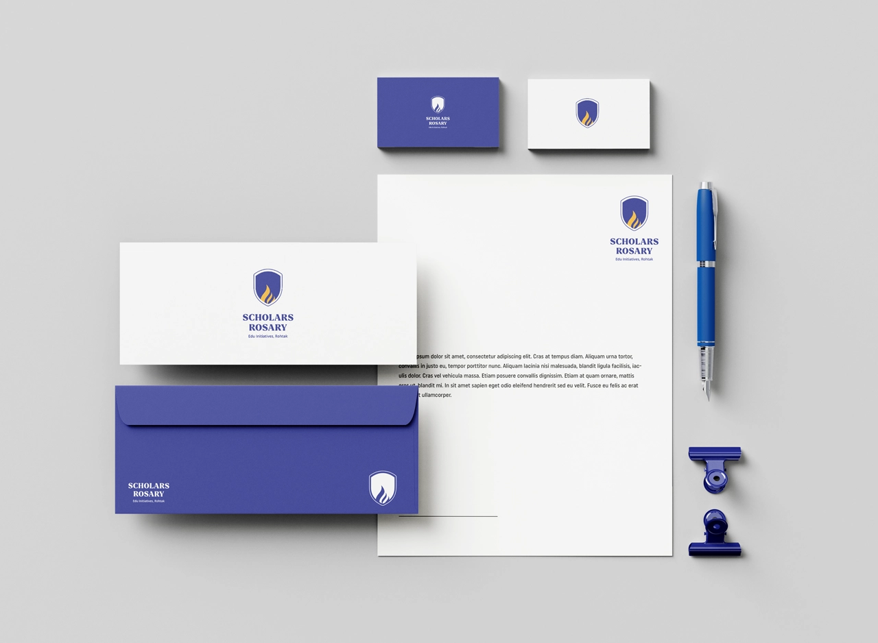
The redesigned identity brings the existing flame into a more structured shield form. The shield introduces an established academic character and gives the mark the presence traditionally associated with schools, colleges and universities. More importantly, it creates a natural visual space in which the flame can sit with clarity and prominence. A repeated outer stroke adds another layer of refinement without making the symbol overly decorative. The result is a mark that feels more complete and institutional while keeping the flame—the most familiar element of the earlier identity—at its centre.
The identity communicates tradition without appearing dated. The shield immediately gives Scholars Rosary an established academic presence, while the simplified flame introduces aspiration, learning and forward movement. Visually, the combination feels more like an evolved institutional identity than a completely new brand. This was particularly important for a school that already enjoyed substantial recognition. The clean geometry, controlled detailing and restrained colour system help the identity feel premium and confident, reflecting an institution that does not need to appear loud in order to communicate its standing.
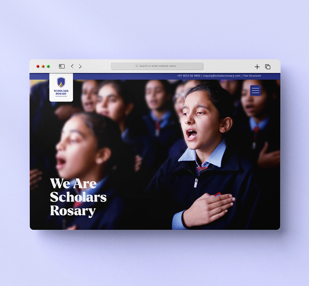
Classical Letterforms Meet a Cleaner Modern Structure
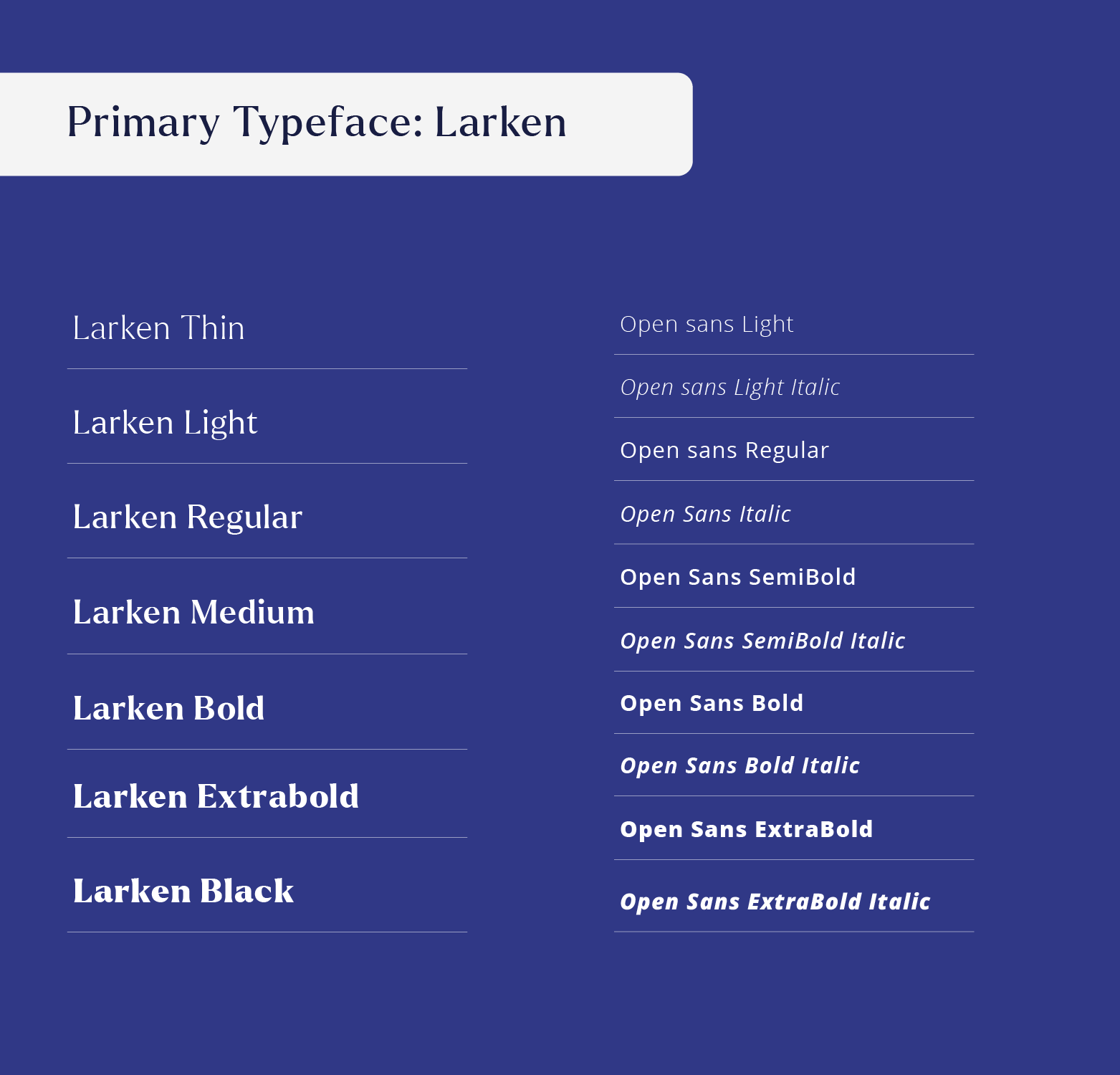
The typography carries a subtle relationship between classical and contemporary design. Strong serif characteristics give SCHOLARS ROSARY authority and an established academic tone, while the relatively clean construction prevents the wordmark from becoming overly traditional. Its broad, substantial letterforms provide a strong visual base beneath the shield and help balance the height of the symbol above. The supporting line is considerably simpler and lighter, creating hierarchy without competing with the main name. Together, the typography and shield create a cohesive education brand identity with both heritage and contemporary discipline.
Refining Familiar Blue and Yellow for Better Balance
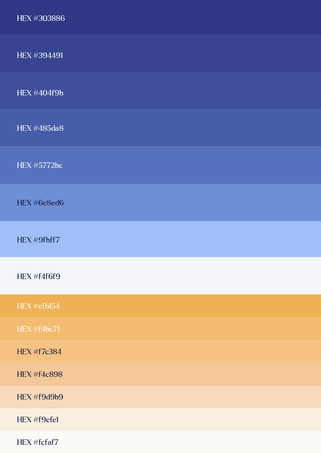
The school wanted to retain its familiar royal blue and yellow, so the redesign focused on refining their tonal relationship rather than introducing an entirely new palette. Blue remains dominant, giving the identity credibility, maturity and institutional strength. Yellow is concentrated within the flame, allowing it to work as a warm focal point against the cooler blue field. This controlled use of colour makes the flame more visible while keeping the overall logo composed. The result preserves an important part of the school’s existing recognition while giving the palette a more polished and premium visual character.



Before Setting Foot on Campus,
Parents Will Check Your School on Instagram.