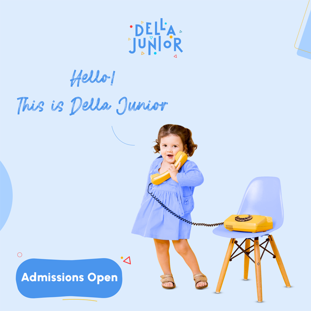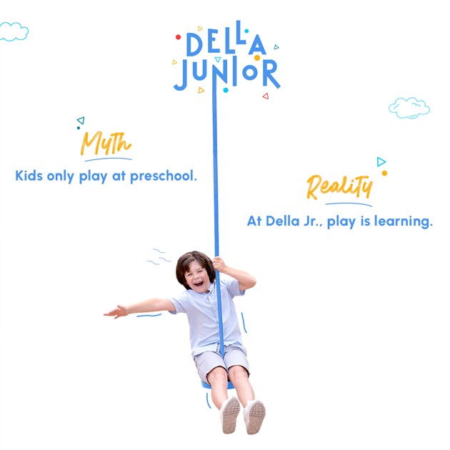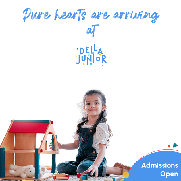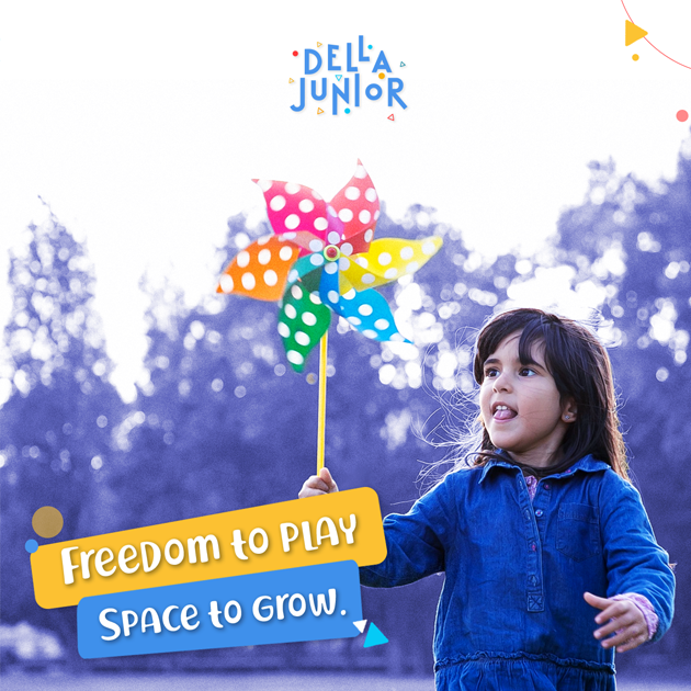
Della Junior is a preschool and play school in Alpha 2, Greater Noida. As a completely new venture, the founders were entering the education space without an existing name, identity or established visual language. The project therefore began at the very foundation: from suggesting the name to creating the logo, colour system and overall brand personality. The objective was to build a preschool brand identity that could immediately feel relevant to young children while remaining distinctive enough for parents to recognise and remember.
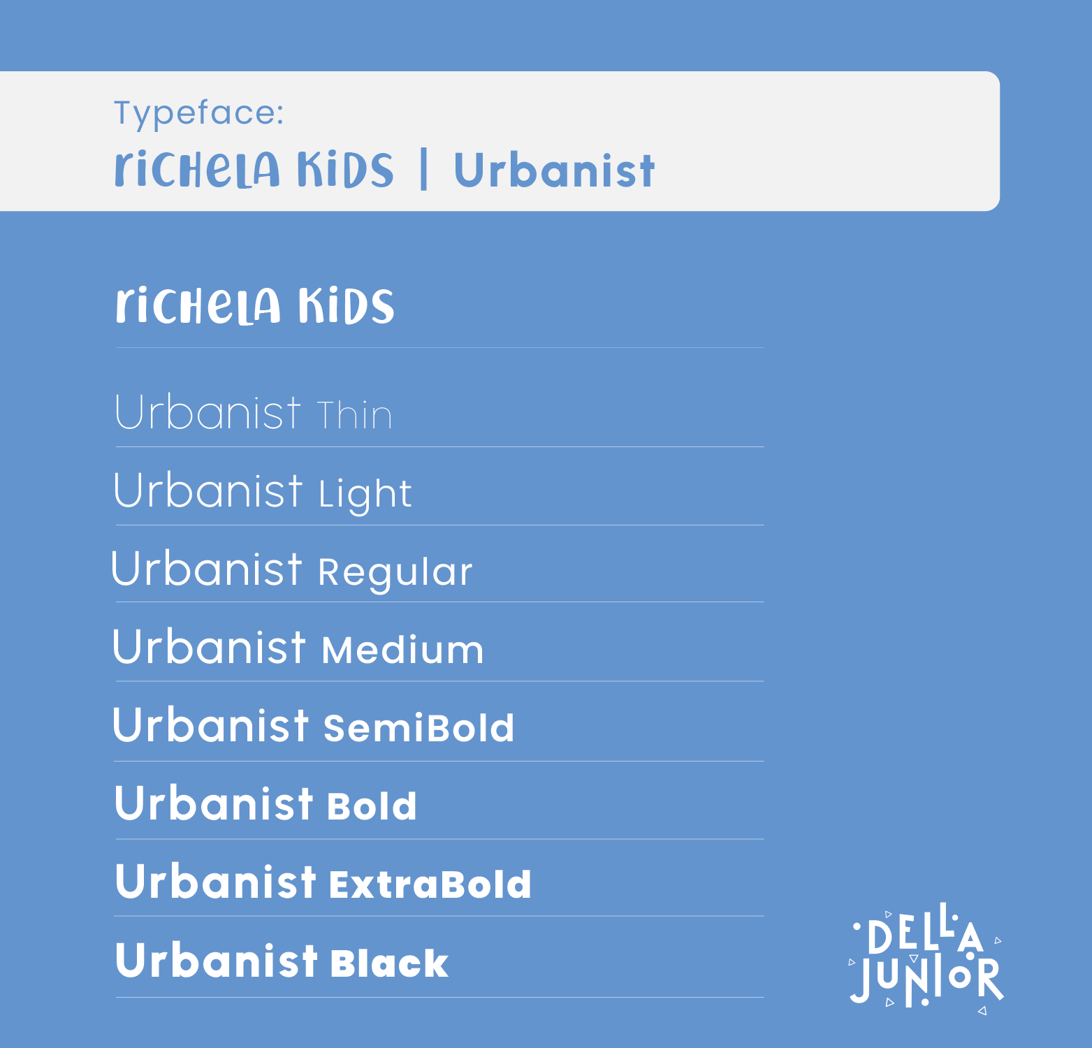
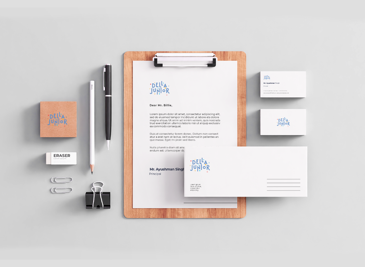
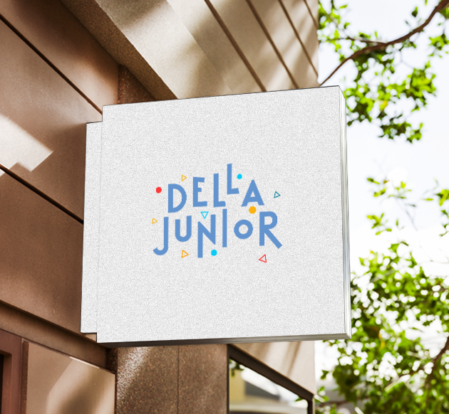
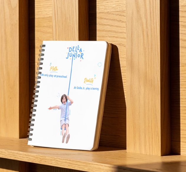
The central idea emerged while experimenting with rough letter sketches. Instead of arranging every character along a predictable baseline, individual letters were deliberately shifted, raised and lowered. This broken alignment introduced movement, rhythm and spontaneity—qualities naturally connected with childhood. The challenge was maintaining readability while allowing the composition to remain irregular. Each letter therefore moves differently, but never so far that the words become difficult to recognise. The resulting logo feels active and slightly unpredictable, much like the visual world of young children.
The identity avoids the neatness and symmetry usually associated with formal educational institutions. Its character comes from controlled irregularity: letters vary in height, position and form while still belonging to one composition. This gives Della Junior an energetic and imaginative personality without depending on mascots or conventional preschool illustrations. The scattered circles and triangular accents add another layer of movement around the wordmark. Together, these choices create a children’s brand that feels cheerful and expressive while remaining visually organised enough to work as a recognisable identity.
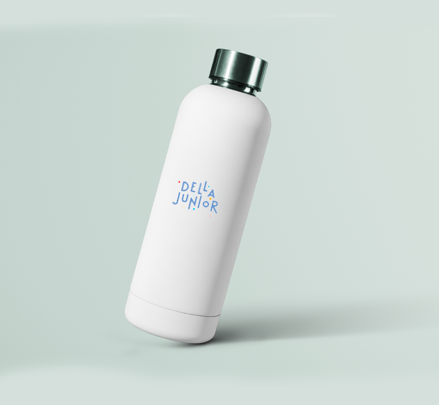
Custom Letterforms Turn Typography into the Logo
Typography is effectively the main graphic element of the identity. Rather than relying on a complete conventional typeface, individual letters were drawn, modified and adjusted specifically for the words Della Junior. Their forms vary, but a broadly consistent stroke weight keeps the composition connected. Some characters are wider, taller or more angular than others, reinforcing the handmade and playful quality. Because the wordmark itself carries so much personality, the logo does not require a separate icon—the lettering becomes both the name and the visual identity.
One Strong Blue Supported by Colourful Accents
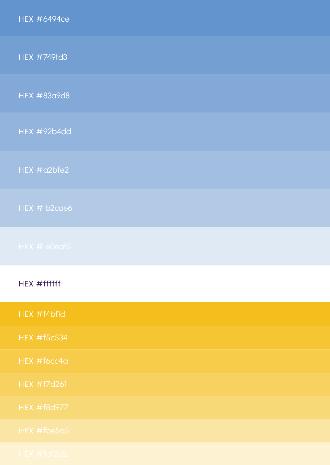
Many preschool identities depend equally on four or five bright colours, making it difficult for any one colour to become strongly associated with the brand. Della Junior deliberately takes a different approach. Blue dominates the identity, creating a clear and repeatable primary brand colour. Smaller accents of red, yellow and cyan introduce the vibrancy expected in the children’s space without competing with that main colour. This hierarchy keeps the identity playful while giving the preschool branding stronger colour recognition and a more controlled visual system.
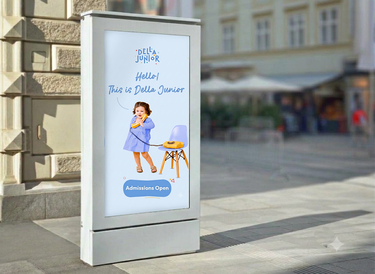


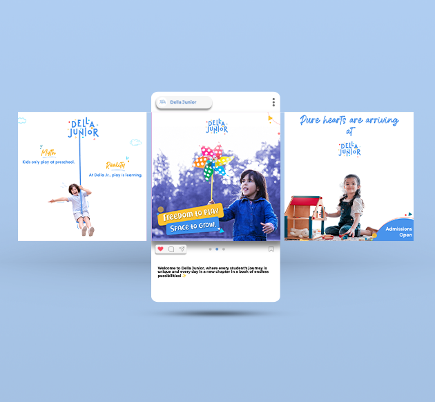
Before Setting Foot on Campus,
Parents Will Check Your School on Instagram.