Vivekanand Vidya Niketan

  • Logo + Branding
  • Social Media Branding
  • Website
  • Print Design
  • School Film

An Academic Institution Built on Proven Performance

Project Brand Identity & Branding
Client Vivekanand Vidya Niketan

Vivekanand Vidya Niketan is an established school located on the Assandh–Jind Road in Karnal district, with Assandh and its surrounding communities forming its primary catchment. The school has earned a strong reputation for academics and places particular emphasis on preparing students for competitive examinations such as JEE and NEET through dedicated academic support. With healthy enrolment already in place, the institution’s larger ambition was to strengthen how it was perceived and build a school brand identity capable of standing confidently alongside better-known education brands in the region.

Rooting the Brand in Vivekananda’s Philosophy

The name Vivekanand Vidya Niketan already carried a powerful association with Swami Vivekananda and his philosophy. Rather than treating that connection subtly, the identity was built around it deliberately and visibly. The idea was to make Vivekananda the central reference point of the brand, giving the school a stronger sense of character and philosophical grounding. This approach also helped align the institution’s academic seriousness, discipline and aspiration with a personality widely associated with knowledge, conviction and self-development. The branding therefore draws its strength from an idea that was already inherent in the school’s name.

Turning a Historic Portrait into a Graphic Mark

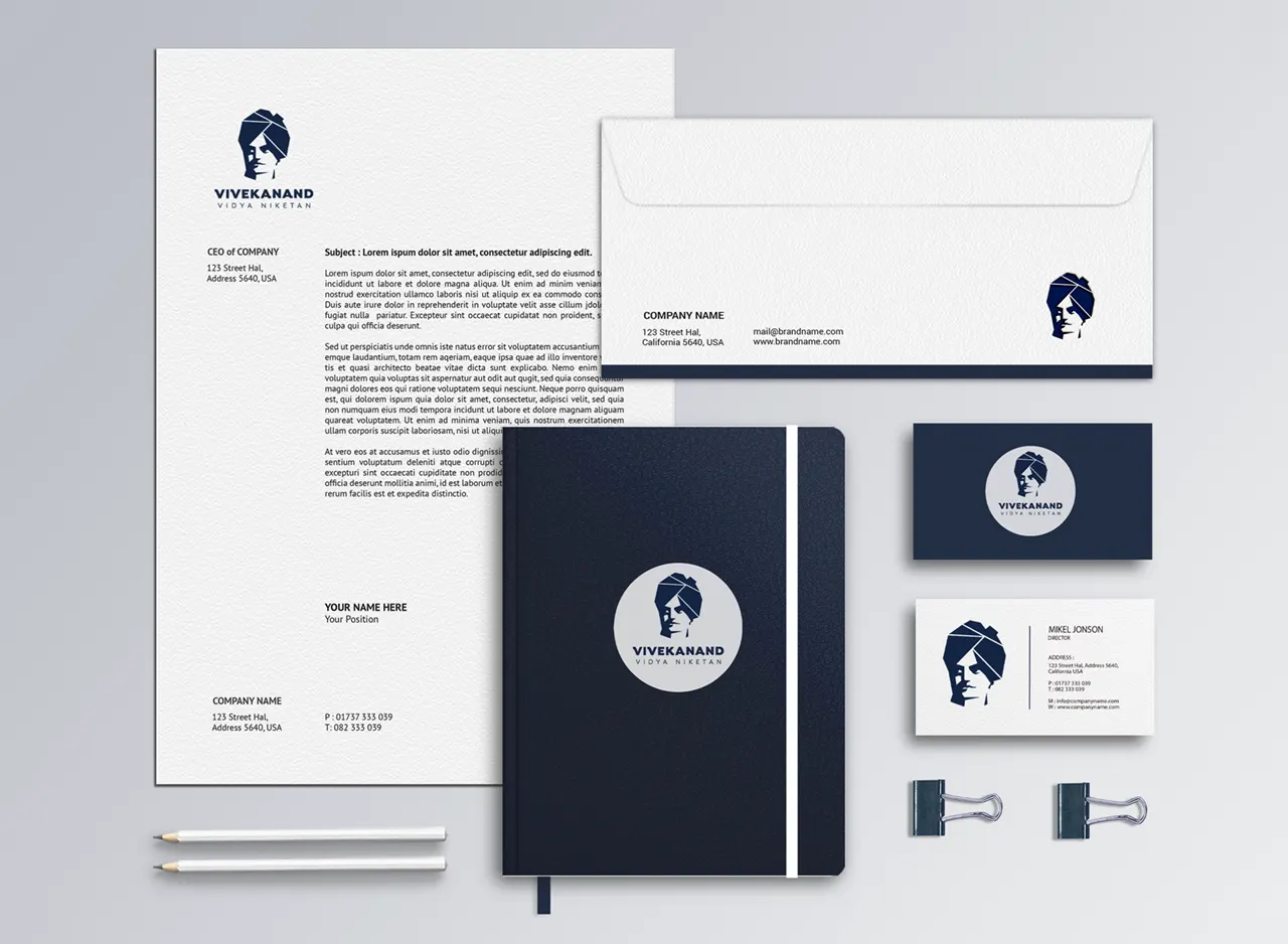
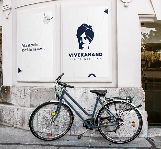
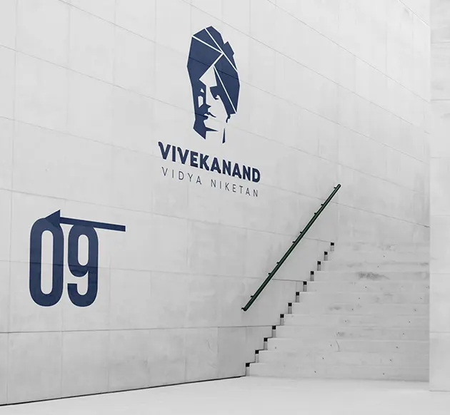
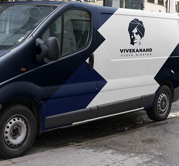
The central design challenge was translating the likeness of Swami Vivekananda into a form that could function as a contemporary logo rather than as a conventional portrait. His face is constructed through simplified areas of light and shadow, using angular, almost faceted shapes to retain recognisable features while reducing unnecessary detail. The negative spaces become equally important: they read less like blank white areas and more like light falling across the face. This gives the mark depth and character while allowing a historically rooted personality to work within a clean, reproducible visual identity.

Academic Authority with a More Human Character

The identity feels serious, disciplined and academically focused, but it avoids becoming cold or overly institutional. The prominent portrait immediately humanises the brand, giving the school a personality rather than relying on conventional academic symbols such as books, shields or crests. The strong geometry of the portrait communicates confidence and conviction, while the typography introduces structure beneath it. Together, these elements give the school branding an established, purposeful character that reflects academic credibility while retaining the human connection inherent in building the identity around a real historical personality.

Bold Typography Creates Both Focus and Balance

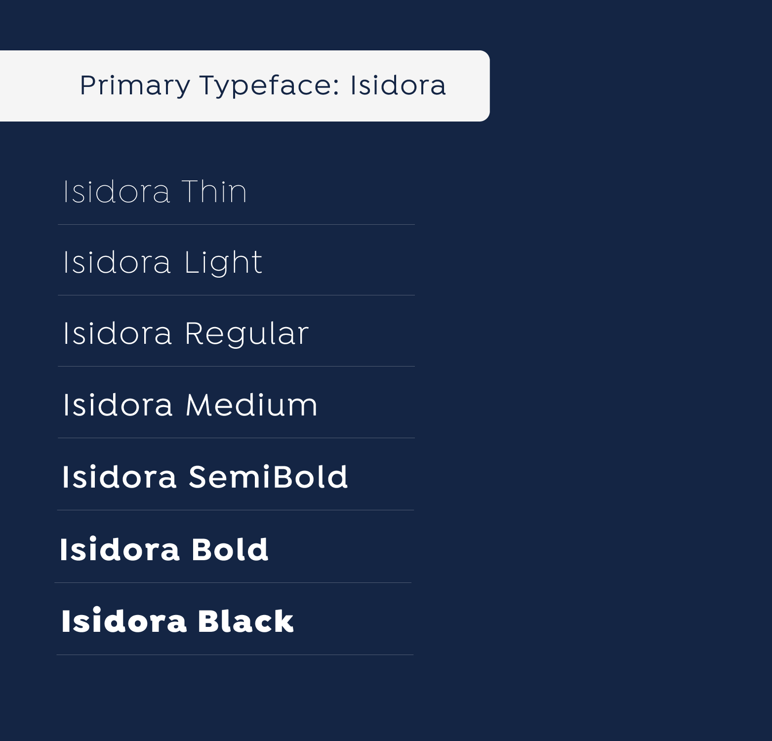
The typographic hierarchy is deliberately clear. VIVEKANAND appears in a broad, heavy display style, giving maximum prominence to the institution’s defining name. Its visual weight also performs an important compositional role by creating a strong base beneath the portrait, preventing the large graphic mark from appearing unsupported or visually suspended. VIDYA NIKETAN is considerably lighter and more widely spaced, allowing it to remain legible without competing for attention. The letterforms carry a slightly human, less mechanically rigid character, helping the typography sit naturally alongside a portrait-based identity rather than feeling excessively corporate.

Navy Blue Lets Light and Shadow Lead

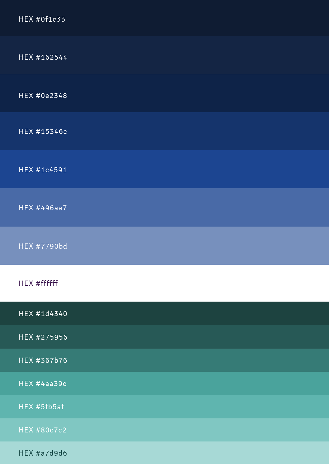
A single deep navy blue gives the identity visual discipline and allows the portrait’s construction to remain the main focus. Instead of relying on multiple colours to separate facial features, the design uses the relationship between solid navy forms and negative space to suggest shadow and light. Navy also brings a mature, dependable and academically serious quality that suits an institution known for educational performance and competitive-exam preparation. The monochromatic treatment makes the school logo highly adaptable while reinforcing the clarity and authority of the overall brand identity.

Before Setting Foot on Campus,
Parents Will Check Your School on Instagram.

CLIENTS STORY

Listen What
Our Clients Saying

Deepika Sharma, Grand Columbus International School, Faridabad

“In 2019, I visited an acquaintance's institution and was impressed with the quality of the branding and marketing work. After five years, the School Saarthi team did justice to our school brand. Be it admission enquiries, website design, or offline campaigns, they have been the best.”

Anubhav Maheshwari, Founder

Saraswati Global School, Greater Faridabad

First principles thinking in education
expressed with primitives

Sip, an AlcoBev delivery platform will deliver alcohol of your choice, to your doorsteps across India now. A much awaited business and delivery platform deserved a unique and celebratory brand idea and approach. ICD creates a memorable, distinct and a delightful brand position, to catch the troubled consumer’s attention. Shop—ship—sip, now always in peace!

More Logo + Branding