Kukdukoo Lit Fest began as a children-focused initiative in Noida, created to bring literature closer to young audiences through experiences rather than conventional reading alone. Kukdukoo was founded in 2018, while its first two-day Lit Fest was held in Noida in February 2019, featuring storytelling, author interactions, theatre, workshops and thousands of children’s books. Over the years, it has evolved into a wider celebration of literature, art, culture and play across multiple Indian cities.
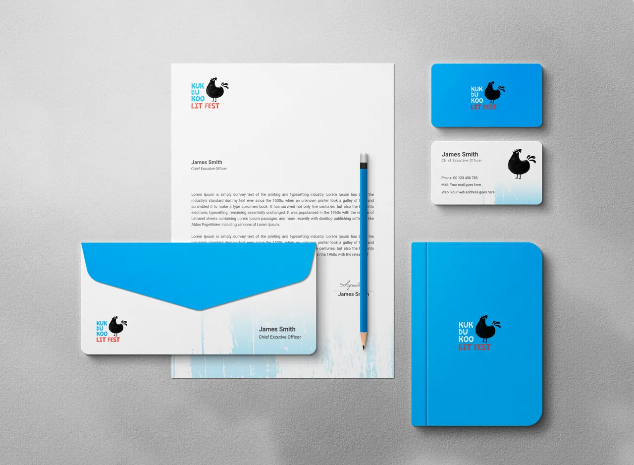
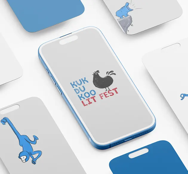
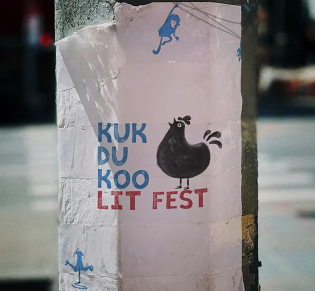
The identity was conceived for an audience largely made up of young children, whose visual world is imaginative, imperfect and highly expressive. Kukdukoo was never meant to feel like a formal literary event. It was a weekend where stories, activities, performances and family time came together as a celebration of childhood. That understanding shaped the entire design direction: rather than creating a polished corporate identity, the visual language needed to feel spontaneous, handmade and slightly unpredictable—closer to something a child might draw, paint or discover inside an illustrated storybook.
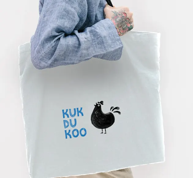
The name immediately suggested a rooster, but the intention was to give the character more personality than a conventional bird illustration. A larger rooster was chosen because its form could carry the presence of an older storyteller—the familiar figure who gathers children around and begins a story. The silhouette is deliberately simple, yet its oversized body, upright neck and expressive tail give it an almost character-like presence. This makes the rooster more than a literal interpretation of the name; it becomes a visual host for the imaginative world of Kukdukoo.
Nothing about the identity tries to feel mechanically precise. The rooster carries visible irregularities and textured areas that make it appear drawn or painted rather than digitally constructed. That imperfection is central to its personality. It gives the brand warmth, individuality and the sense of something created by hand. For a children’s festival built around stories, art and participation, this human quality was more appropriate than perfect geometry. The resulting identity feels playful without becoming overly cartoonish, allowing both children and parents to connect with it.
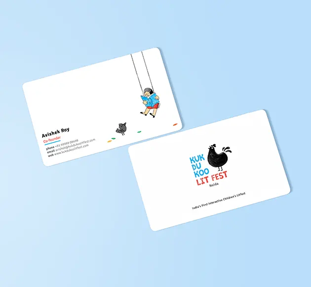
Brush-Like Forms Bring the Identity Together
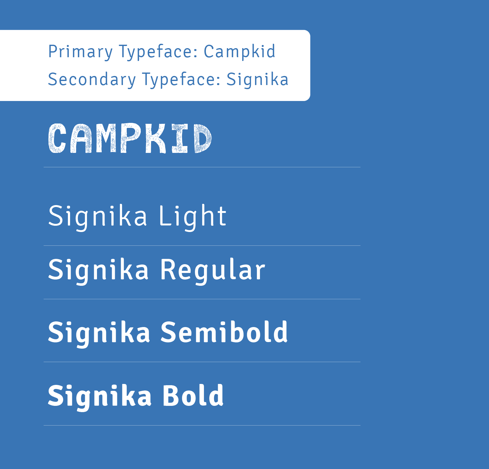
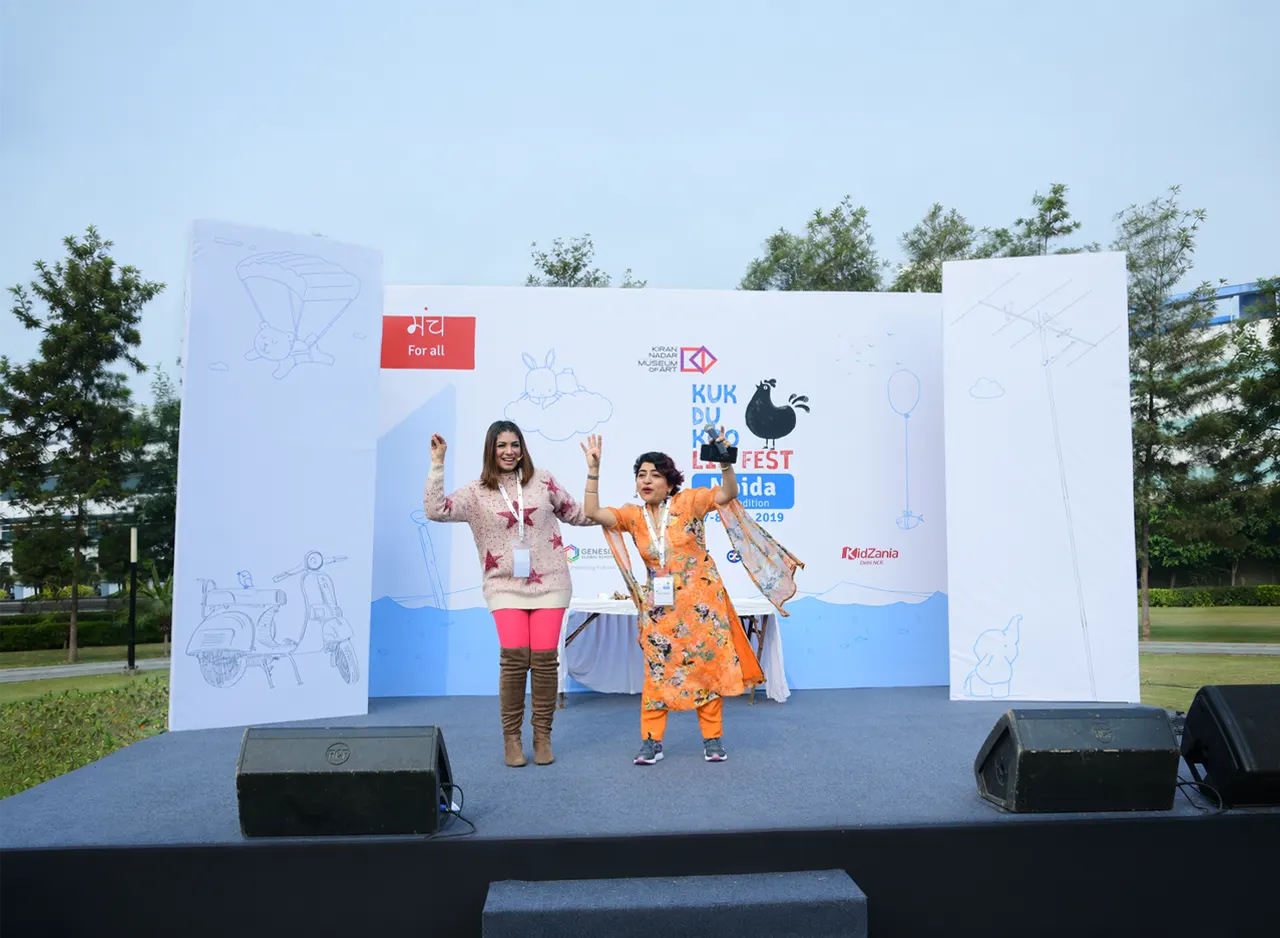
The illustration relies largely on broad, organic forms and brush-like textures, with small irregular details preventing the rooster from becoming a flat black silhouette. The original typography followed the same philosophy: uneven, informal and deliberately less balanced than a conventional typeface, creating the impression of letters painted or written by hand. This relationship between illustration and lettering helped the complete identity feel like one visual family. As the festival expanded and practical applications increased, the typography was later revised, but the distinctive rooster remained the central graphic asset.
Black Gives the Rooster Its Unexpected Character
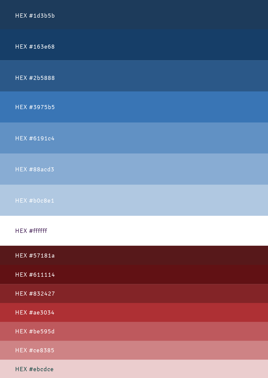
Black became the defining colour of the rooster for both visual and conceptual reasons. It naturally connects with pencil marks, ink and brush strokes, supporting the handmade character of the illustration while also making an unusual rooster instantly memorable. Sky blue introduces a cooler, youthful quality into the typography, while red is used sparingly as a stronger accent rather than allowing it to dominate the palette. Together, the three colours create an energetic children’s identity while leaving the black rooster as the unmistakable centre of attention.
Before Setting Foot on Campus,
Parents Will Check Your School on Instagram.