Little columbus

  • Logo & Brand Identity
  • Social Media Branding
  • Website
  • Print Design
  • School Film

A Familiar Preschool Brand with a New Direction

Project Brand Identity & Branding
Client Little Columbus

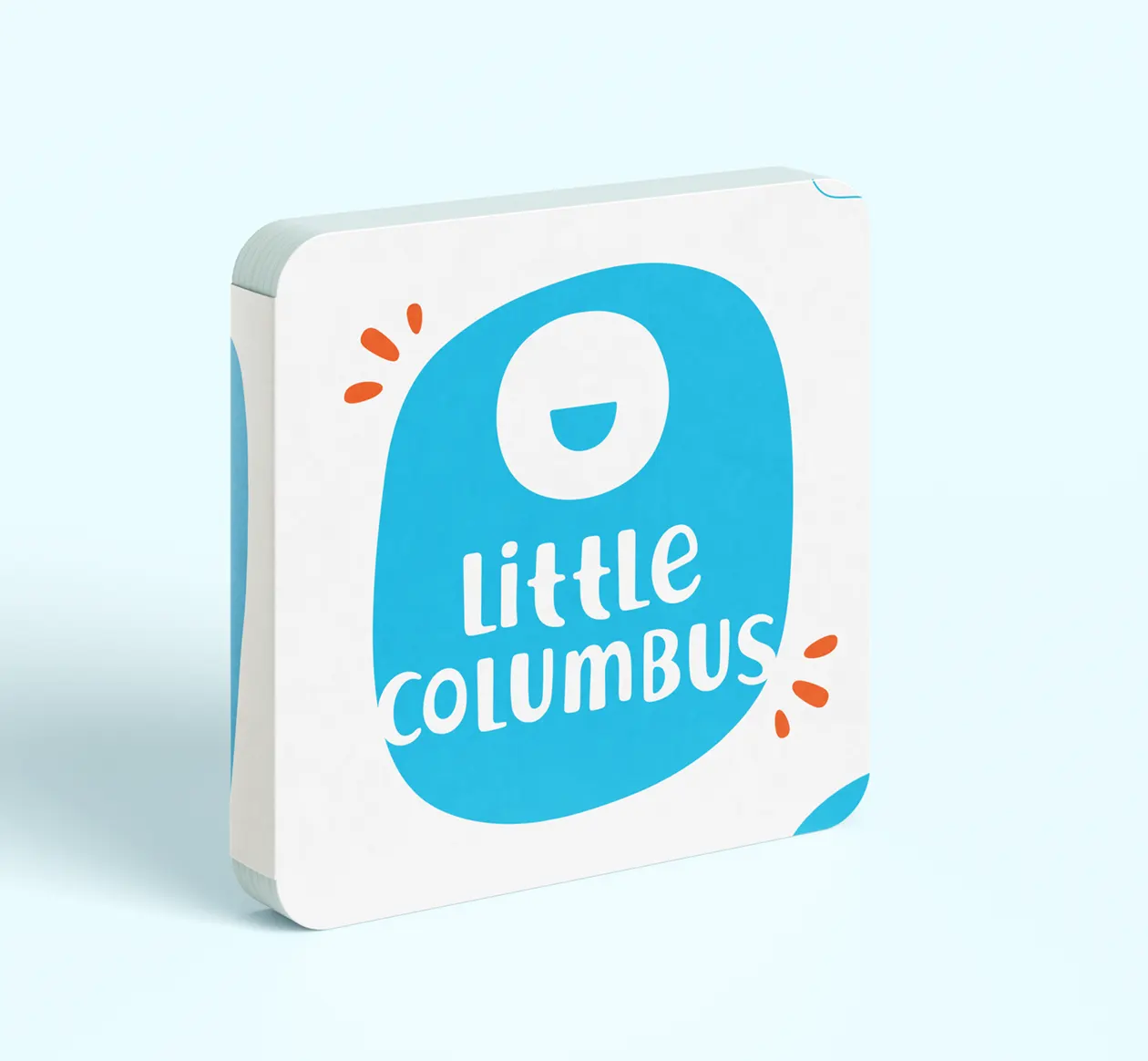
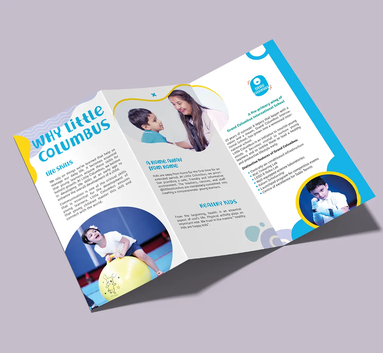
Little Columbus is a preschool and play school operating from the ground floor of Grand Columbus International School in Sector 16A, Faridabad. The name already had recognition in the local market before becoming part of the Grand Columbus education group. Rather than absorbing it completely into the parent school, the decision was made to retain Little Columbus as a distinct sub-brand, preserving its existing familiarity while giving it a fresh visual identity and clearer personality.

Preserving Recognition While Building a Fresh Identity

The acquisition created an interesting branding opportunity. Grand Columbus and Little Columbus naturally belonged to the same naming family, yet merging both identities would have weakened the independent recognition Little Columbus had developed over many years. The refreshed identity therefore needed to feel youthful and self-contained while remaining comfortably connected to the larger education group. This approach allowed the preschool brand to retain its own space in the market while supporting future expansion into new locations.

A Smiling Shape Built Around Childhood Happiness

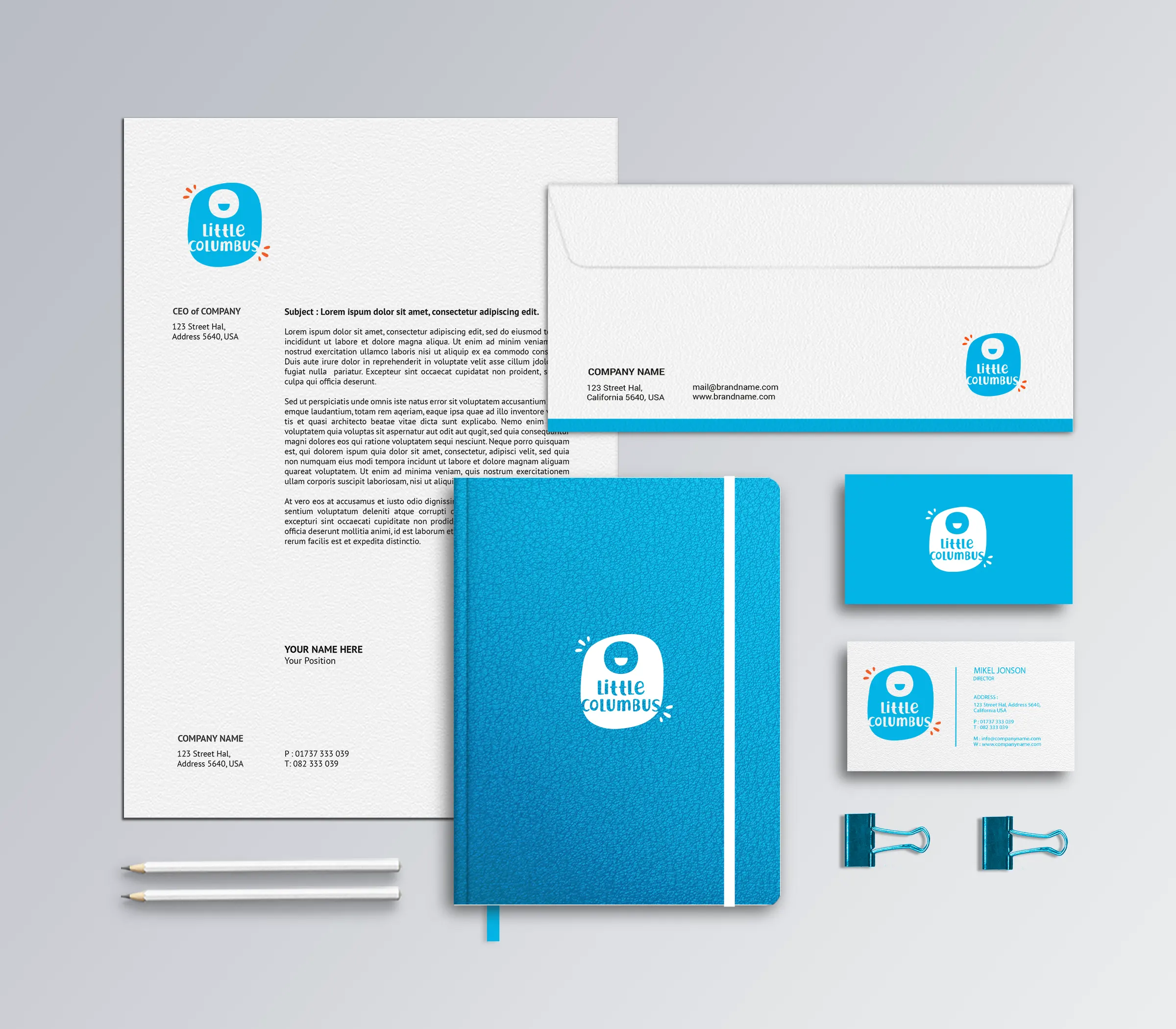
The central form is intentionally simple, soft and friendly. Inside the rounded blue shape sits a minimal smiling face, introducing the emotion that matters most in early childhood education: happiness. For parents, a preschool is not only about learning; it is also about knowing that their child feels comfortable, safe and cheerful away from home. The smiling symbol gives this emotional promise a direct visual expression without relying on complicated illustrations or conventional preschool mascots.

Playful Letterforms Celebrate Childhood Imperfection

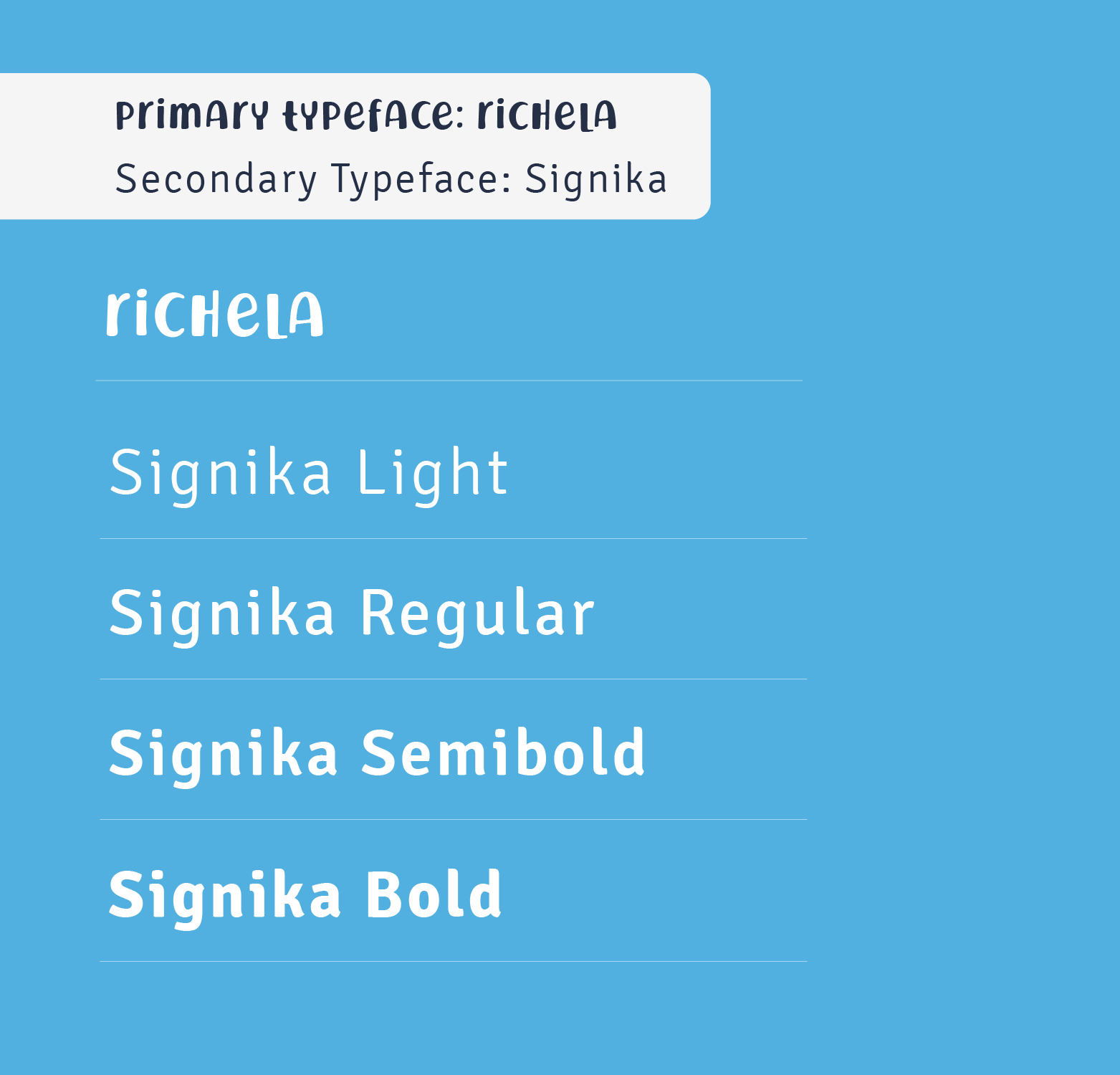
The typography deliberately avoids formal alignment and perfect uniformity. A mix of uppercase and lowercase characteristics, irregular proportions and handmade-looking letterforms gives the name a spontaneous, childlike personality. These imperfections are intentional rather than accidental, reflecting the stage at which children are still discovering writing, shapes and expression in their own way. The playful lettering works naturally with the rounded symbol, creating a preschool brand identity that feels warm, energetic and approachable rather than academically formal.

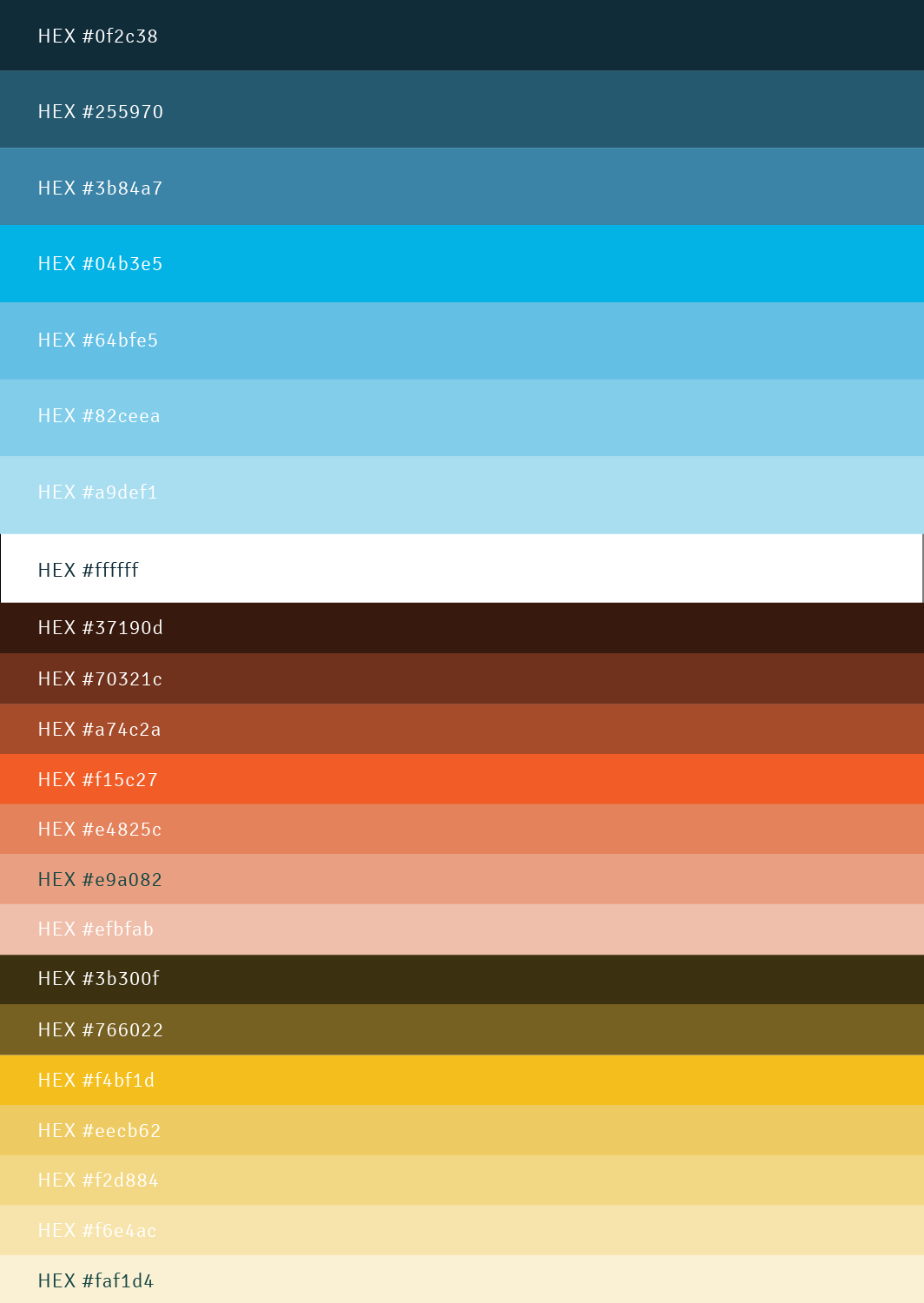
Sky Blue Leads, While Orange Adds Energy

Instead of using many colours equally, the identity allows sky blue to become the dominant and recognisable brand colour. Its freshness gives the logo an open, cheerful and youthful presence. Small orange strokes are added only as accents, bringing warmth, movement and visual contrast without competing with the primary colour. Their limited use keeps the composition controlled while adding just enough vibrancy for the children’s space, resulting in a colourful identity without becoming visually overcrowded.

Before Setting Foot on Campus,
Parents Will Check Your School on Instagram.

CLIENTS STORY

Listen What
Our Clients Say

Deepika Sharma, Little Columbus

"The School Saarthi team is incredibly passionate and talented. They guided us in brand repackaging, website design, and enrolment strategy. In our inter-school event, the ‘Goonj’ team Saarthi made up the whole premises engaging and lively through space design."

Deepika Sharma

Little Columbus

More Logo + Branding