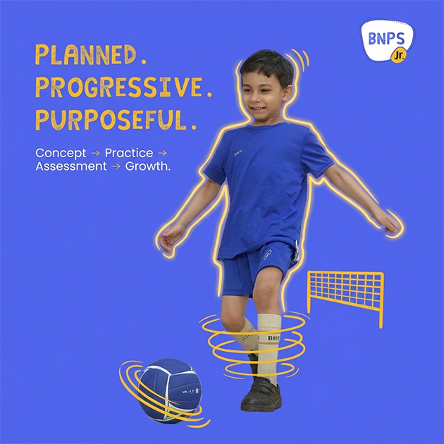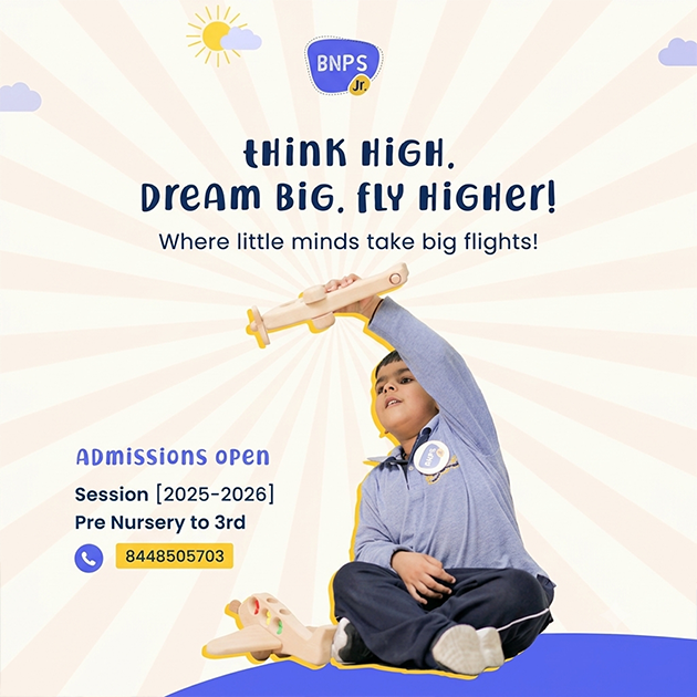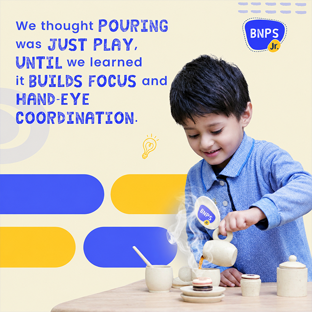
BNPS Junior is the preschool extension of Bharat National Public School, a four-to-five-decade-old institution serving the Ram Vihar–Karkardooma area of Delhi. The parent school has built strong credibility through its curriculum, teaching practices and consistently high parent demand. Created in 2025 for a new preschool space in nearby Krishna Nagar, BNPS Junior needed to carry the familiarity and trust of BNPS, while speaking in a completely different visual language suited to younger children and their parents.
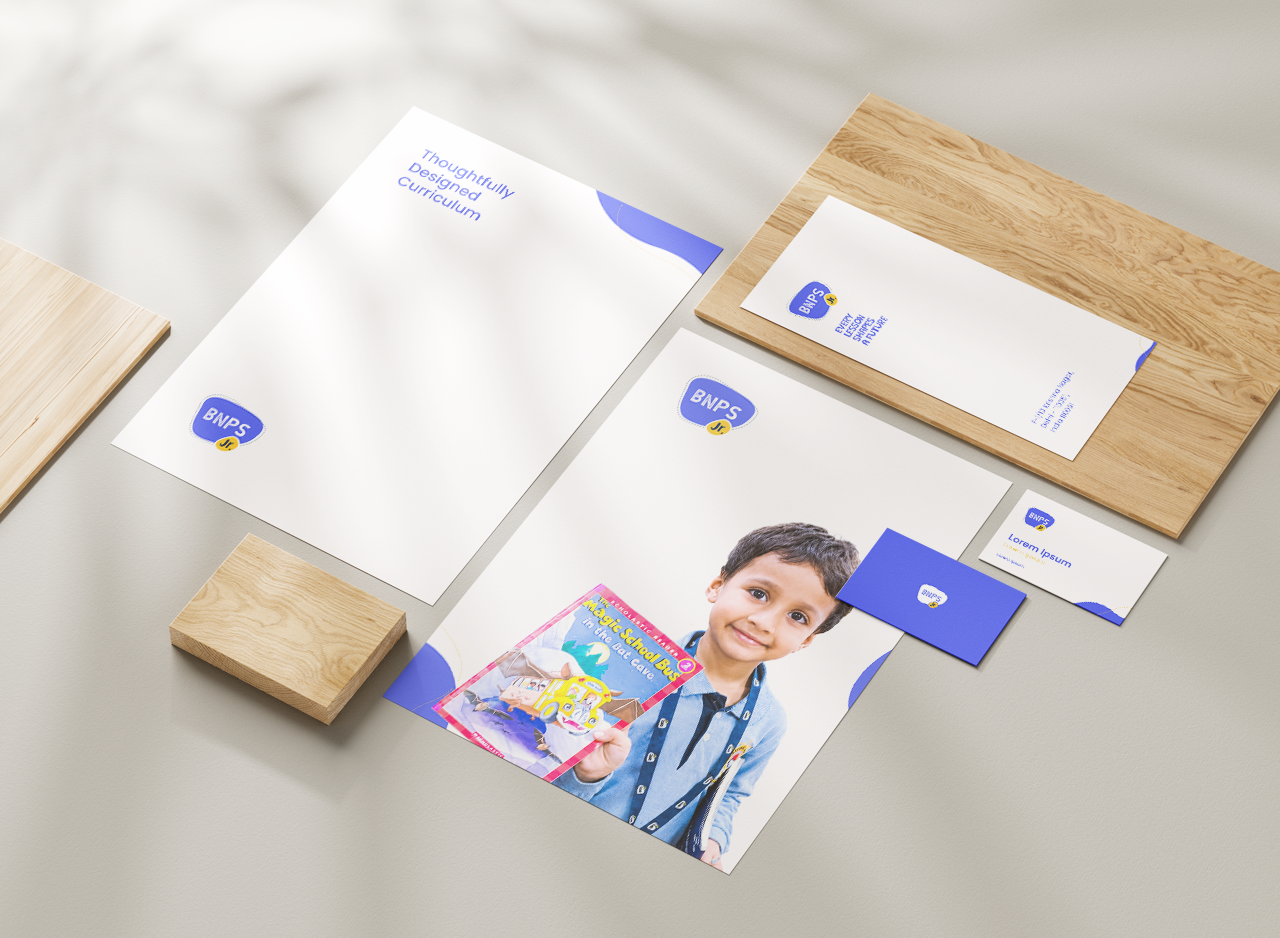
The name BNPS Junior was deliberately retained close to the parent institution so that the new preschool could benefit from the recognition already attached to BNPS. However, visually repeating the senior school identity would have made the preschool feel too formal. The brand therefore became a younger interpretation of the same family—recognisable through the BNPS name, but lighter, friendlier and far more expressive. This balance allows the preschool brand identity to inherit institutional credibility without losing the playfulness expected from an early-years environment.
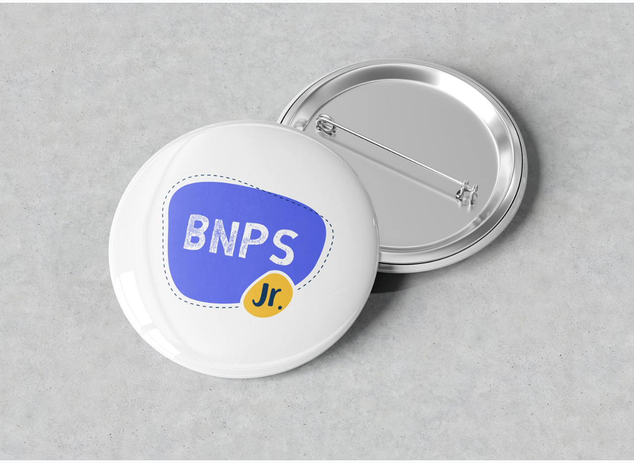
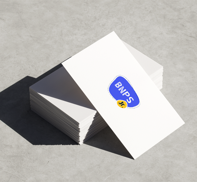
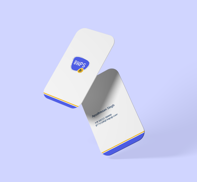
The identity is built around free-flowing organic forms rather than rigid geometry. A large irregular blue shape holds BNPS, while a smaller yellow form creates a separate space for Jr. Their asymmetry makes the composition feel spontaneous, energetic and less mechanically designed. A loose dotted outline around the main form adds another layer of movement, almost like a child tracing around a shape. These elements give the logo warmth and informality without relying on conventional preschool illustrations or mascots.
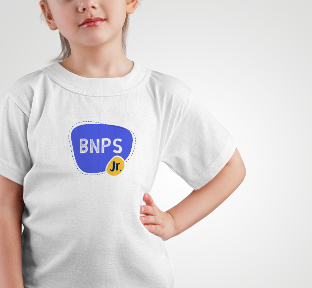
Handmade Lettering Makes the Identity More Personal
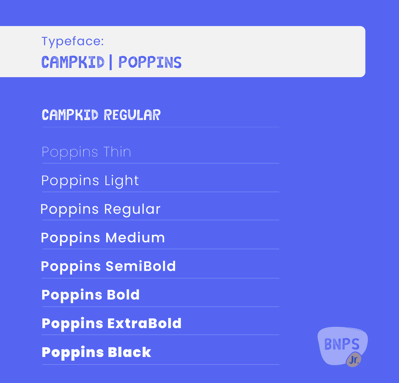
The typography reinforces the same informal character. BNPS uses bold, textured letterforms that appear closer to brush lettering than perfectly finished digital type, introducing a handmade and personal quality. Jr. is treated differently, helping it function almost like a small badge attached to the main identity while retaining its own playful personality. The contrast between the two lettering styles adds visual interest, yet the organic shapes surrounding them keep the complete composition connected as one cohesive education brand identity.
Royal Blue and Yellow Create Fresh Energy
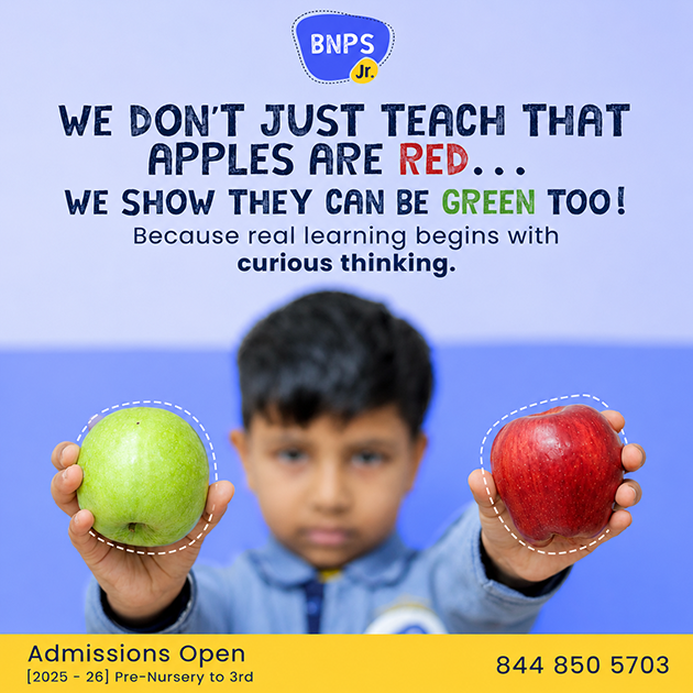
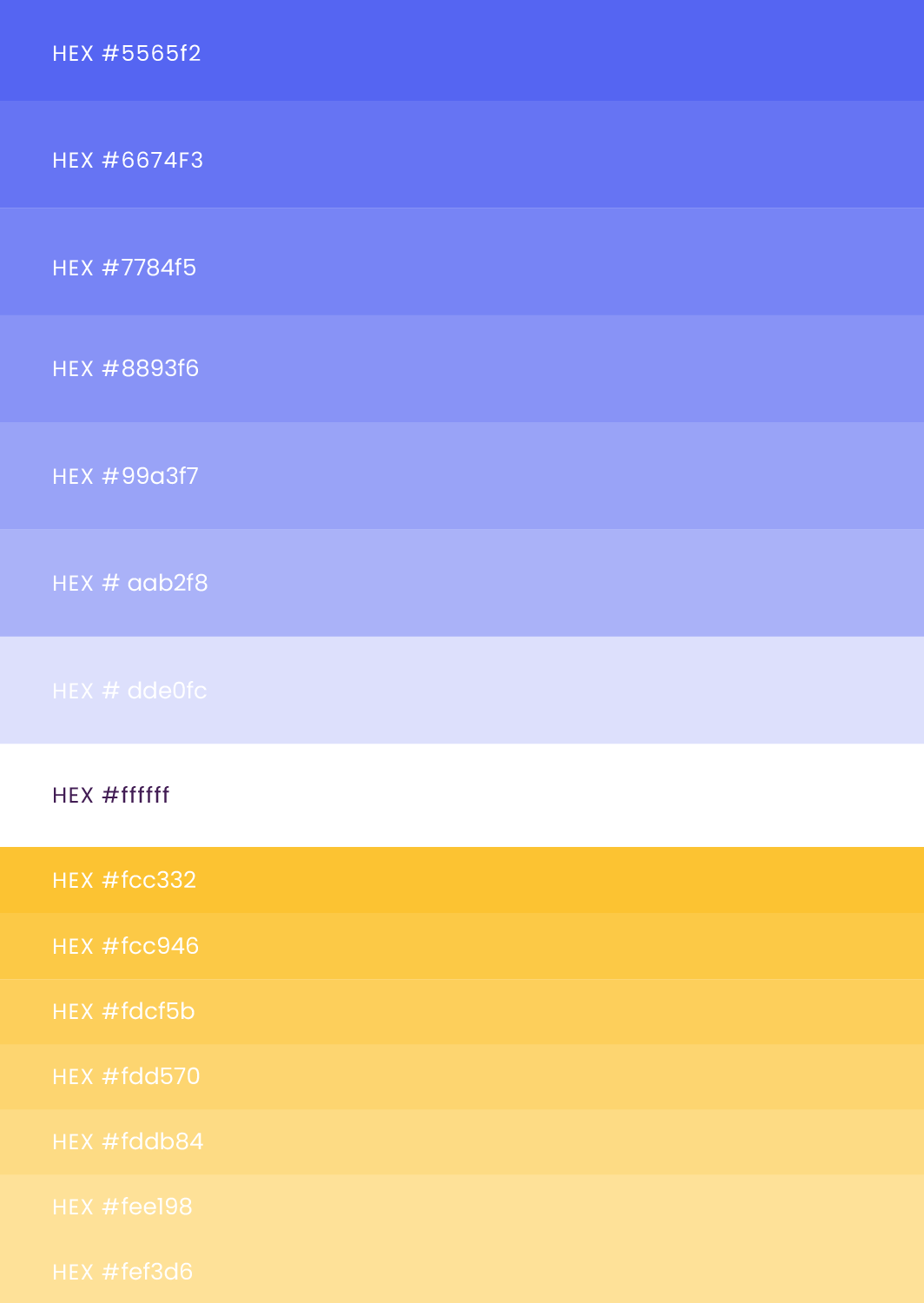
Royal blue forms the dominant colour, preserving confidence and enough visual strength to connect the preschool with a larger educational institution. The selected tone is intentionally brighter and fresher than a dark institutional blue, preventing the identity from feeling serious or mature. Yellow provides a warm, energetic contrast and is concentrated within the smaller Jr. element, giving it immediate prominence. Together, the two-colour system remains simple enough for strong brand recognition while providing the vibrancy needed across preschool spaces, print and digital communication.