Deepika Sharma, Grand Columbus International
School, Faridabad
Grand Columbus International School

Grand Columbus International School is located in Sector 16A, Faridabad, close to Mathura Road. Despite operating on a comparatively compact two-acre campus, the school has used its space intelligently to create a modern, well-planned and premium environment. Over time, it has developed the character of a boutique school—smaller in scale, yet carefully designed in its infrastructure, presentation and overall experience. This refined physical environment became an important reference point for how its visual identity needed to feel.
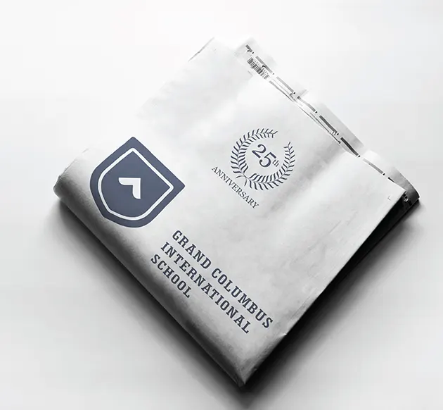
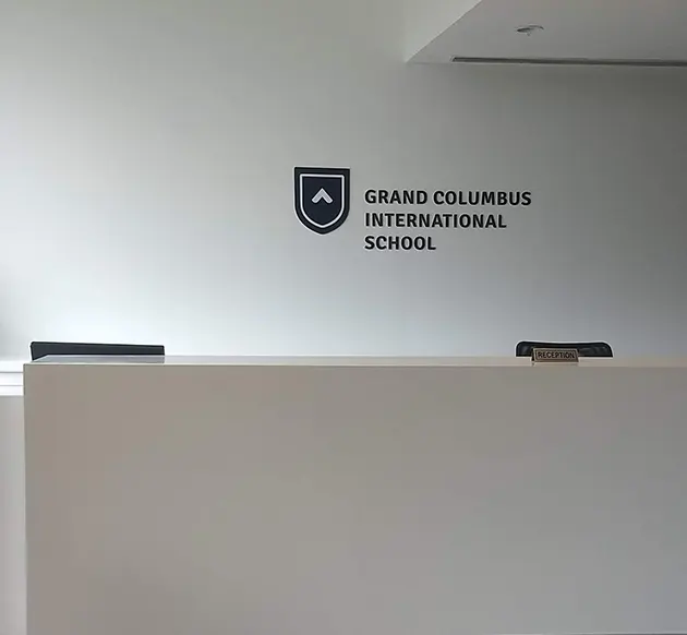
The institution predates the Grand Columbus name, which was introduced in 1994 with the founder’s vision of creating a futuristic school with modern infrastructure. Ahead of its silver jubilee year in 2019, the school decided to refresh its brand identity. School Saarthi had initially been involved with environmental and space design, but the engagement gradually expanded into wider branding. The logo became an important starting point for creating a more distinctive and consistent identity that could better match the school’s evolved physical environment.
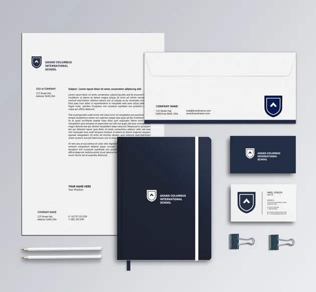
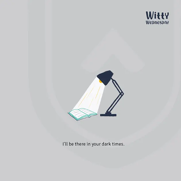
The design direction was intentionally minimal. A shield provides the primary structure, giving the identity an academic and institutional reference without relying on a traditional school crest. At its centre sits a simple upward-moving form, visually suggesting aspiration, progress and forward movement. Its simplicity allows the symbol to communicate quickly and remain recognisable at different scales. Together, the shield and upward form create an education logo design that feels contemporary while still retaining enough institutional character to clearly belong to a school.
The identity communicates confidence through restraint rather than decorative detail. Its symmetrical structure, generous negative space and simplified geometry make the logo feel contemporary, organised and premium. The upward element introduces aspiration without becoming literal or overly descriptive, while the surrounding shield gives that movement a sense of stability. This balance reflects the school itself: progressive in outlook, but grounded as an established institution. The visual language is deliberately understated, allowing the brand to appear mature and distinctive rather than competing through complexity.
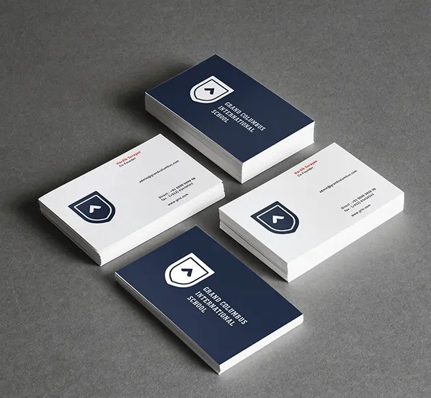
Rounded Geometry Creates One Visual Family
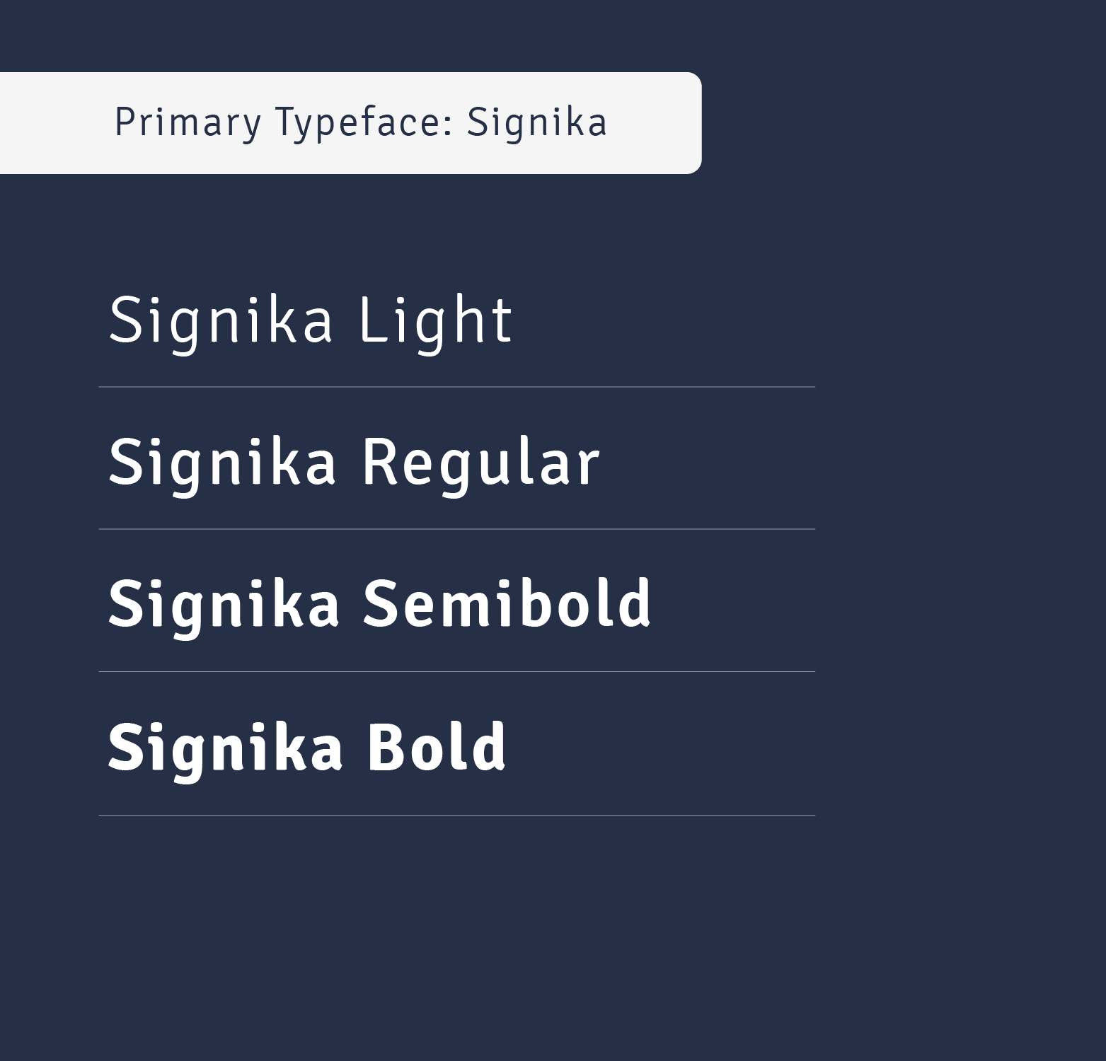
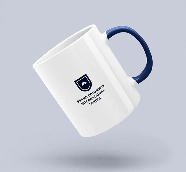
The shield uses softened lower corners instead of a rigid angular construction, and the central upward mark follows the same rounded visual language. This relationship was extended into the typography, where strong sans-serif letterforms carry a similarly clean and slightly softened character. Because Grand Columbus International School is a long name, it is arranged across three lines with consistent weight, creating a compact and balanced lock-up. Horizontal and vertical versions further extend the flexibility of the school brand identity across signage, stationery and different spatial applications.
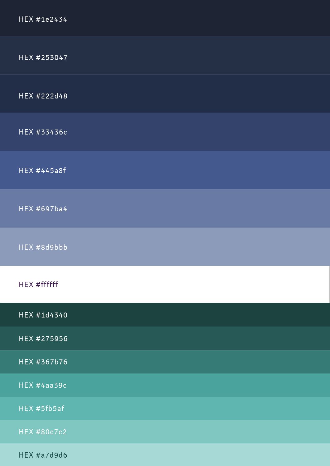
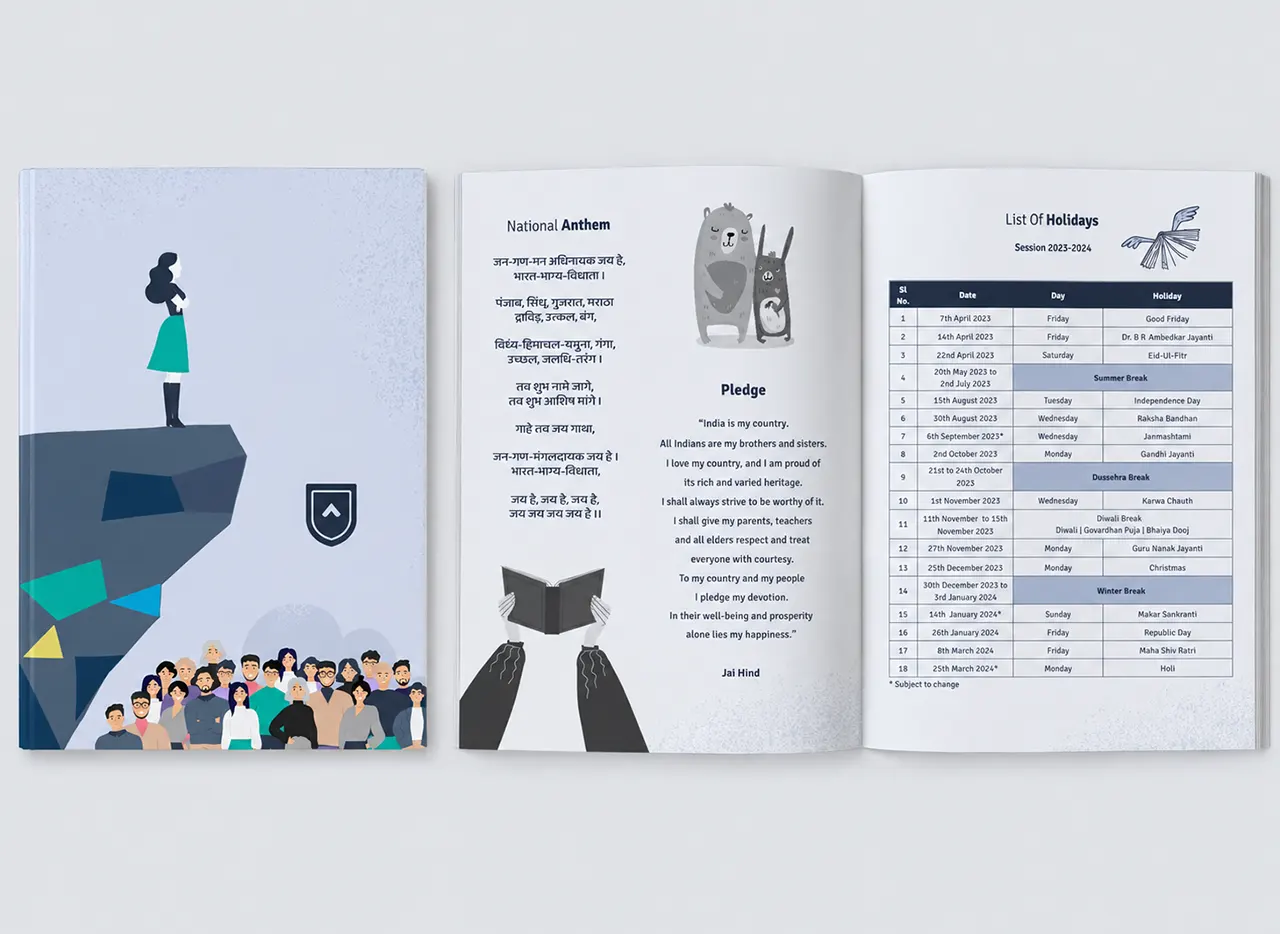
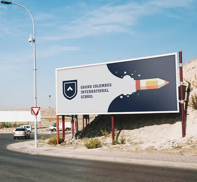
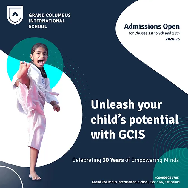
The principal logo is deliberately monochromatic, using a deep navy blue to create a calm, credible and premium visual presence. Keeping the mark to one dominant colour strengthens recognition and allows it to work consistently across different applications. A secondary cyan tone was introduced within the broader brand system for contrast in graphics and communication, but kept outside the core logo. Over time, blue became a defining part of the school’s visual environment, extending across the façade, classrooms, corridors and signage and creating unusually strong brand consistency.


Grand Columbus International School