Refreshing the Identity Before a Milestone Year
The institution predates the Grand Columbus name, which was introduced in 1994 with the founder’s vision of creating a futuristic school with modern infrastructure. Ahead of its silver jubilee year in 2019, the school decided to refresh its brand identity. School Saarthi had initially been involved with environmental and space design, but the engagement gradually expanded into wider branding. The logo became an important starting point for creating a more distinctive and consistent identity that could better match the school’s evolved physical environment.
Reducing Education to Two Simple Symbols
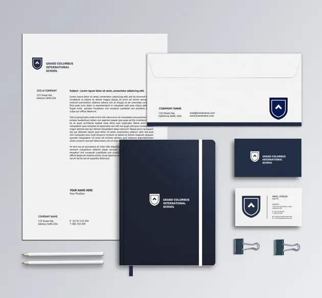
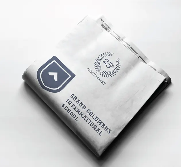
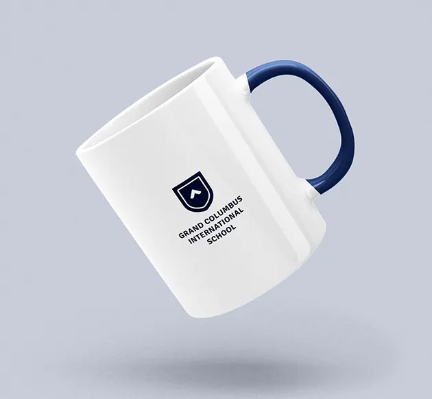
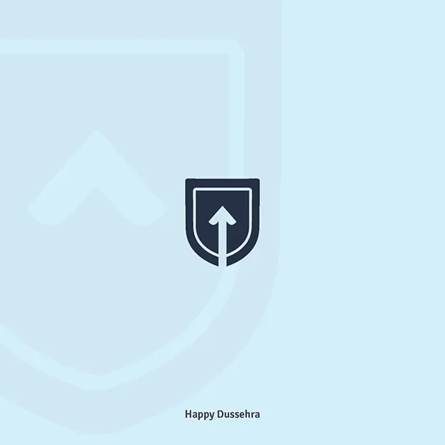
The design direction was intentionally minimal. A shield provides the primary structure, giving the identity an academic and institutional reference without relying on a traditional school crest. At its centre sits a simple upward-moving form, visually suggesting aspiration, progress and forward movement. Its simplicity allows the symbol to communicate quickly and remain recognisable at different scales. Together, the shield and upward form create an education logo design that feels contemporary while still retaining enough institutional character to clearly belong to a school.
Minimal, Confident and Quietly Aspirational
The identity communicates confidence through restraint rather than decorative detail. Its symmetrical structure, generous negative space and simplified geometry make the logo feel contemporary, organised and premium. The upward element introduces aspiration without becoming literal or overly descriptive, while the surrounding shield gives that movement a sense of stability. This balance reflects the school itself: progressive in outlook, but grounded as an established institution. The visual language is deliberately understated, allowing the brand to appear mature and distinctive rather than competing through complexity.