From a Marketing Idea to a Distinct Identity
The Peacock Scholarship began as a communication and outreach idea before evolving into a separate visual identity. Once the concept was accepted by Saraswati Global School, the opportunity was to create a recognisable identity around it rather than present the scholarship merely as another campaign. This gave the initiative a stronger presence in parent communication while allowing the school to approach the market more indirectly. The resulting sub-brand therefore works as an extension of Saraswati Global School’s broader education branding rather than competing with the main school identity.
Making the Peacock the Natural Visual Centre
With a name like Peacock Scholarship, the bird itself became the most direct and memorable visual idea. The mark uses a simplified peacock silhouette with an extended ornamental tail, allowing the identity to remain immediately readable without becoming overly illustrative. The sweeping feather forms bring movement and elegance, while the circular accents within the plumage add rhythm and visual interest. Rather than trying to create an abstract metaphor, the design embraces the strength of the name and turns it into an easily recognisable symbol.
Familiar to the Parent Brand, Distinct in Character
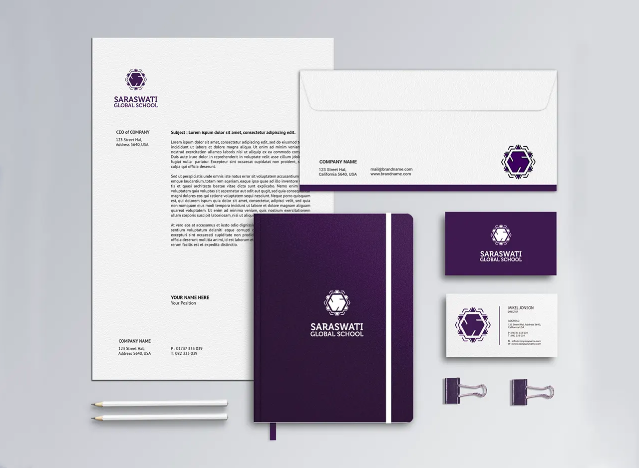
The identity carries the visual familiarity of Saraswati Global School while introducing a more expressive and celebratory personality. Purple creates the strongest link with the parent brand, establishing continuity and institutional association. The peacock form, flowing feather structure and brighter accent colours make the scholarship identity feel more approachable, energetic and distinctive. This balance is important for a sub-brand: it feels connected enough to inherit credibility from Saraswati Global School, yet individual enough to build its own recall across scholarship communication and promotional material.