CASE STUDY
Vivekanand Vidya Niketan
Inquiry Generated
Cost Per Lead
Admissions Done
From academics and teacher retention to infrastructure, branding and parent communication, we identified practical changes that could strengthen the school’s value, perception and long-term growth.
Introduction
An established school with decades of experience approached us at an important stage of its growth. It had a strong legacy, an experienced management team and a positive internal culture, but it was operating in an increasingly competitive market where newer and larger schools were changing parent expectations.
The challenge was unusual. The school could not simply compete by adding more land, larger playgrounds or extensive infrastructure. Its physical space was limited, and several shared facilities were already under pressure. At the same time, the management wanted to strengthen the existing school, introduce senior secondary grades and create a distinct early-years offering.
Our consulting exercise therefore began with a larger question:
How can a school grow when increasing its size is not necessarily the best option?
Instead of treating its limitations as weaknesses, we looked for opportunities hidden within them. The strategy eventually touched almost every part of the institution—from academics, teachers and infrastructure to branding, parent psychology and communication.
Challenge
The Brand Had Gradually Become “VVN”
Over the years, an internal convenience had slowly turned into an external branding problem.
Founders, faculty, students and other stakeholders had become accustomed to referring to Vivekanand Vidya Niketan simply as VVN.
There is nothing inherently wrong with an acronym when the acronym itself has accumulated strong recognition and meaning. In this case, however, “VVN” communicated almost nothing to someone encountering the school for the first time.
More importantly, every time the institution introduced itself as VVN, it gave up the opportunity contained in the word Vivekanand.
The school already possessed a name capable of carrying ideas of education, character, discipline, youth and purpose. Yet its most valuable verbal brand asset was being abbreviated out of the conversation.
Before we could solve the visual identity, we therefore had to solve the verbal identity.
A Traditional Identity Without Visual Consistency
The existing visual identity had evolved in a conventional school-design language. It contained multiple elements but lacked a clear, distinctive visual idea.
There was another practical problem: consistency.
Colours and visual applications varied between digital communication and the physical school environment. Different touchpoints did not always appear to belong to the same brand.
A logo is valuable only when it can build recognition repeatedly. If its colours, proportions, treatments and visual language keep changing, that recognition weakens.
The school therefore needed more than a better-looking symbol. It needed an identity that could remain recognisable across everything from a website or social media post to signage, stationery, uniforms and large-format applications.
The Hardest Question: Can Swami Vivekananda’s Face Become a Logo?
Once we agreed that the new identity should draw directly from Swami Vivekananda, another design problem emerged.
A portrait is not automatically a logo.
A realistic face contains shadows, expressions, textures and numerous small details. These may work beautifully in a photograph or illustration, but they become difficult to reproduce when a logo has to appear:
- in a single colour,
- in black and white,
- at a very small size,
- on embroidery or merchandise,
- on signage,
- in print, and
- across different digital formats.
Reducing a portrait also creates another risk. Remove too little detail and it remains an illustration rather than a logo. Remove too much and the person is no longer recognisable.
That balance became the central design challenge:
How do we make Swami Vivekananda unmistakably recognisable while reducing his portrait to the simplicity required of a modern graphical mark?
Solution
First, We Brought “Vivekanand” Back
Our first recommendation had nothing to do with drawing.
We asked the management to gradually move away from using VVN as the primary way of referring to the institution.
Changing an established habit is harder than changing a logo. People inside the organisation had been saying VVN for years, so simply issuing a branding instruction would not change the culture overnight.
We therefore started with the founders.
The recommendation was simple: even when the complete name felt too long for everyday conversation, call it “Vivekanand School” rather than VVN.
The management understood the strategic value immediately.
This small change allowed every verbal mention of the school to reinforce an association that the acronym could never create. Instead of introducing three letters requiring explanation, the school could repeatedly reinforce the strongest word it already owned.
The branding process had therefore begun before the first line of the new logo was drawn.
From a Portrait to a Graphic Identity
For the visual identity, our designers began with a detailed reference image of Swami Vivekananda.
We did not attempt to jump directly from a portrait to a minimal symbol.
Instead, the process happened gradually.
Across approximately 10–15 iterations, detail was removed step by step. With every iteration, the portrait became simpler, cleaner and more geometric.
But every reduction created a question:
Have we simplified the face—or have we simplified it so much that it is no longer Vivekananda?
That made the exercise unusually demanding.
The designers had to continuously balance two opposing requirements:
recognition and reduction.
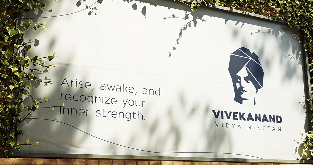
Eventually, the unnecessary detail disappeared while the essential visual character remained. The final identity retained a clear suggestion of Swami Vivekananda but expressed it through simplified graphical forms rather than portrait-style illustration.
Designed to Work in One Colour
One of our tests for the new identity was deliberately simple:
Would it still work if every colour were removed?
The answer needed to be yes.
A strong logo should not depend on gradients, photographic details or multiple colours to remain recognisable. The final mark was therefore designed to work effectively in a single colour and could be reproduced in different brand colours, black or white depending on the application.
This substantially increased its usability across physical and digital environments.
More importantly, simplification gave the school something the previous identity lacked—visual control.
Instead of adapting the logo differently each time, the same recognisable form could travel consistently across multiple brand touchpoints.
Recognisable Even at a Small Size
The final test was scale.
School logos frequently appear in extremely small applications—social media profile images, website headers, stationery, badges and digital thumbnails.
A detailed portrait would lose its character almost immediately when reduced.
The new symbol was deliberately simplified until even at a small size it continued to give a recognisable visual suggestion of Swami Vivekananda.
That was an important measure of success for us.
We had not simply created an illustration that looked impressive when displayed prominently. We had created a functional identity system capable of surviving real-world use.
The Larger Branding Idea
This project reinforced one of our strongest beliefs about school branding:
Sometimes the biggest brand opportunity already exists inside the school—you simply have to recognise it.
Vivekanand Vidya Niketan did not need an invented story.
It already had one of the most powerful names it could ask for.
The problem was that the name had gradually been reduced to three letters, while its visual identity did little to recover the association.
Our solution therefore worked at two levels.
First, we encouraged the organisation to once again say Vivekanand.
Then we created an identity that allowed people to see Vivekanand.
The craftsmanship lay in making both simple enough to be remembered.
What began as a logo redesign ultimately became an exercise in reclaiming the strongest asset the school already possessed—its own name.